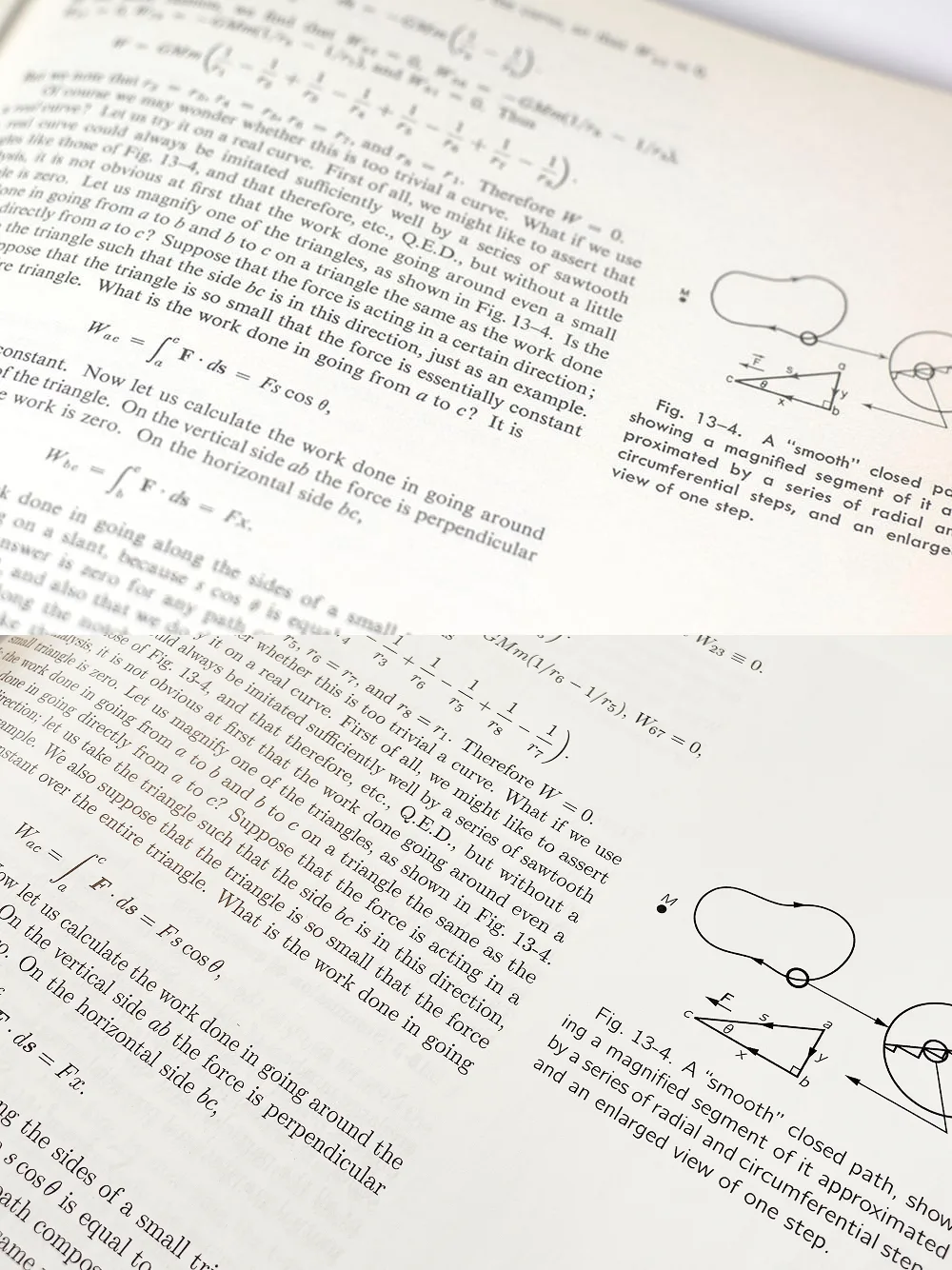
I found a photo from the previous edition of The Feynman Lectures on Physics published by Pearson/Addison-Wesley. It looks better than the New Millennium Edition from Basic Books that I have. I love Verdana, but the move from Futura to Verdana is sad. Futura feels very "Space Age" and academic. Verdana feels "odd" and digitally generic. The figures also look warmer when they aren't as sharp as they are in the newer edition. The pages were thicker, too; the new edition’s pages are so thin that you can see the text from the next page.
The only, but very big reason to choose the newest edition is the huge number of errors they fixed.