I might have been hard on Google as Apple showed their Liquid Glass design. Now, they are taking the crown of the stupidest design system from Google. More readability and accessibility issues, more bubbafication, more stupid animations.
I might have been hard on Google as Apple showed their Liquid Glass design. Now, they are taking the crown of the stupidest design system from Google. More readability and accessibility issues, more bubbafication, more stupid animations.
From Better, Easier, Emotional UX: The research behind Google’s bold new direction for design
Material 3 Expressive is the most researched update to Google’s design system, ever. Here, Material researchers share the data behind the designs and new insights into users’ preference for emotion-driven UX.
Google released Material 3. Now, this might be the stupidest and ugliest design system out there.
From Building a slow web:
The internet I came to love was quieter. Smaller – which is not to say small. It was still vast, but it was a vast collection of small sites instead of a small collection of vast sites.
Ditching big platforms and using my personal blog instead was the best decision I did in the last year. I still post on Instagram once or twice a year and visit a few subreddits, but my RSS reader is now my primary source for content.
First, calculate the velocity of the CM frame:
Now, calculate velocities of particles in the CM frame:
In the CM frame, particles will have the same speeds after elastic collision, meaning:
The directions of these velocities will be opposite, that is:
Now, let’s move back to the lab frame:
Let’s calculate the dot product:
Therefore, the final velocities are orthogonal:
Previous solution, which doesn’t use the center-of-mass frame, can be found at A more elegant solution can be found in Feynman’s Lectures Exercises 8.2.
A moving particle collides perfectly elastically with an equally massive particle initially at rest. Show that the two particles move at right angles to one another after the collision.
From conservation of momentum, we write the equations for the and axes:
From the second equation:
This gives:
Now, from conservation of kinetic energy:
Square the momentum equation and substitute :
Rearranging:
Divide both sides by :
Use the earlier ratio:
Substitute:
So:
This gives:
Therefore:
The two particles move at right angles after the collision.
A more elegant solution can be found in Feynman’s Lectures Exercises 8.2 via the Center-of-Mass Frame.
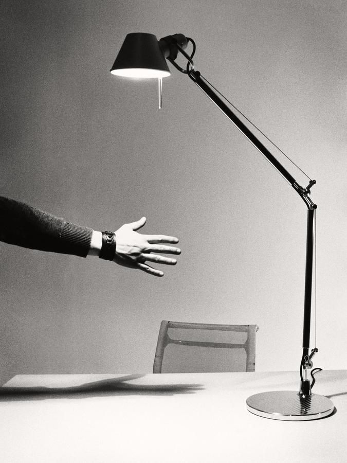
Replaced my old IKEA desk lamp with Artemide Tolomeo.
It’s a simple design. Some screws are visible, and you can tighten them when needed. My version is aluminum, so there’s no chance of paint chipping. You can use any bulb up to 70W. The lamp and its mount are sold separately, giving you plenty of options—you can even turn it into a reading lamp with a floor stand. Artemide sells all the spare parts, so you can fix it if anything breaks.
The philosophy of Artemide is that the product lasts for generations. Starting from the design, the quality of materials and manufacturing, our lamps are made to last over time and designed to be repaired if any component is damaged by accidental events during use.
This lamp is the definition of good design.
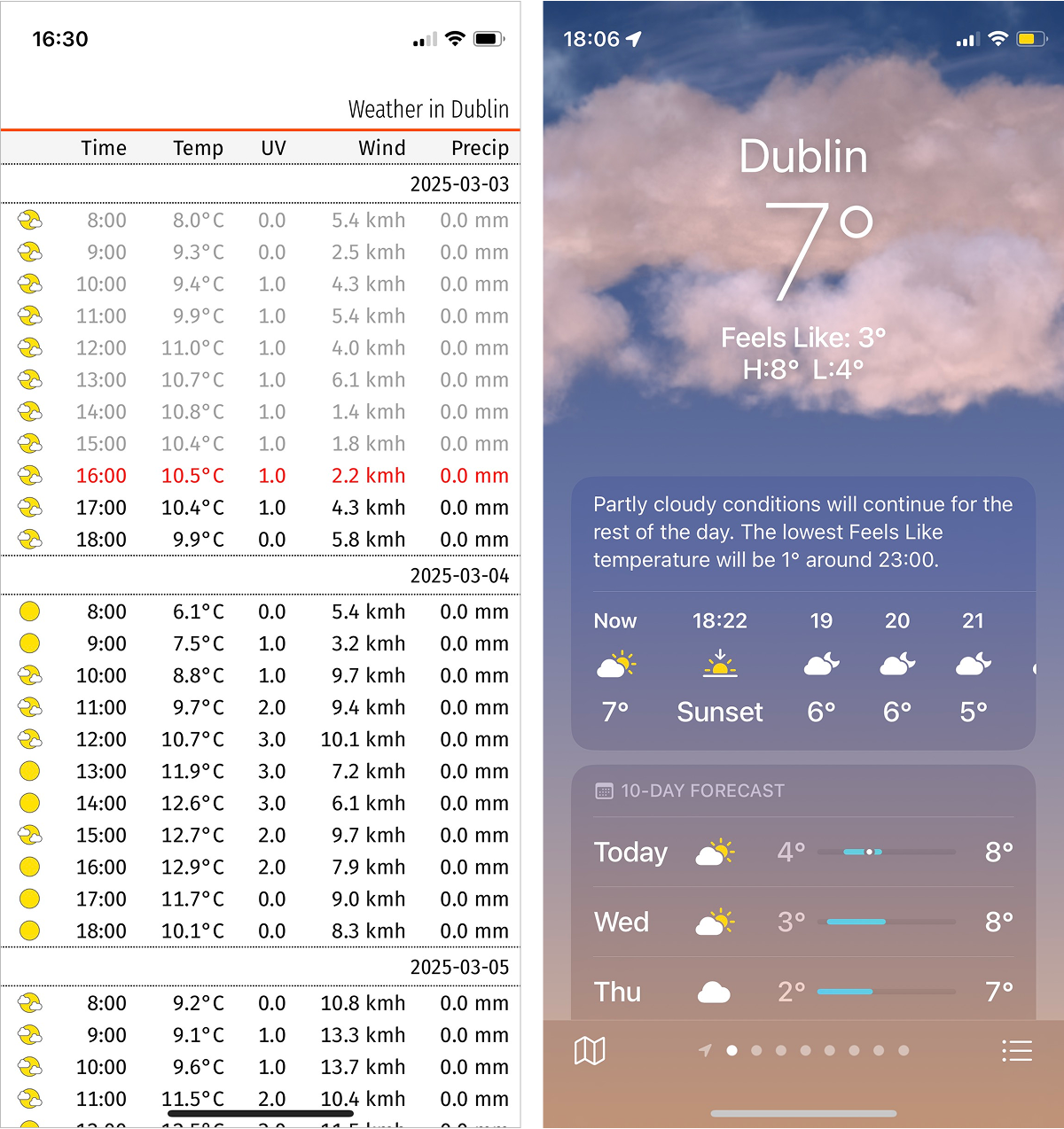
I’ve been working on a weather forecast app that presents information in a more compact form.
It’s easy to see the difference in perception when you compare the two approach side by side. You can see the entire day’s temperatures at a glance, without scrolling or tapping. The current temperature is visible but doesn’t take half the screen. A full week’s forecast is accessible with just one or two scrolls.
It’s currently available at weather.simonuvarov.com, but works for Dublin only.
It’s a Progressive Web App (PWA), meaning you can install it on your phone’s home screen. Once installed, it behaves almost like a native app, including the app icon (shown at the beginning of this post).
There’s still work to be done, but it’s so much nicer to use already.