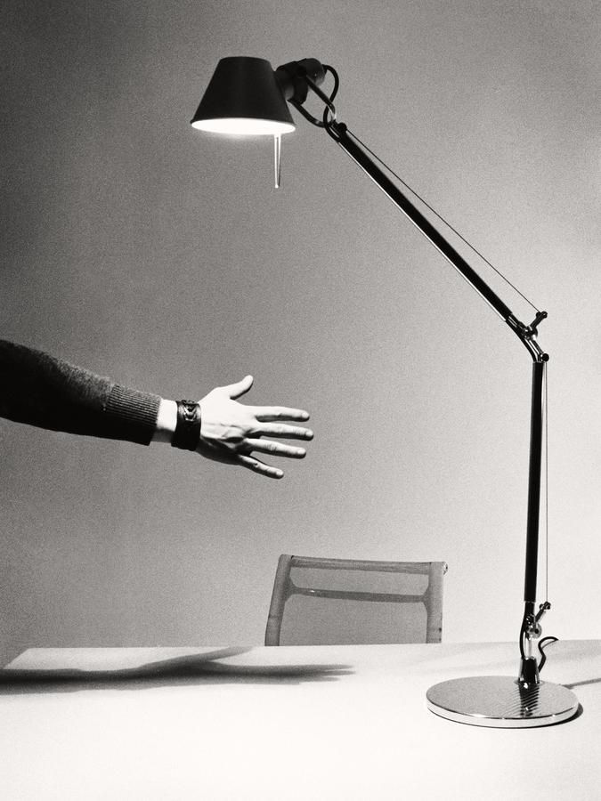
Replaced my old IKEA desk lamp with Artemide Tolomeo.
It’s a simple design. Some screws are visible, and you can tighten them when needed. My version is aluminum, so there’s no chance of paint chipping. You can use any bulb up to 70W. The lamp and its mount are sold separately, giving you plenty of options—you can even turn it into a reading lamp with a floor stand. Artemide sells all the spare parts, so you can fix it if anything breaks.
The philosophy of Artemide is that the product lasts for generations. Starting from the design, the quality of materials and manufacturing, our lamps are made to last over time and designed to be repaired if any component is damaged by accidental events during use.
This lamp is the definition of good design.

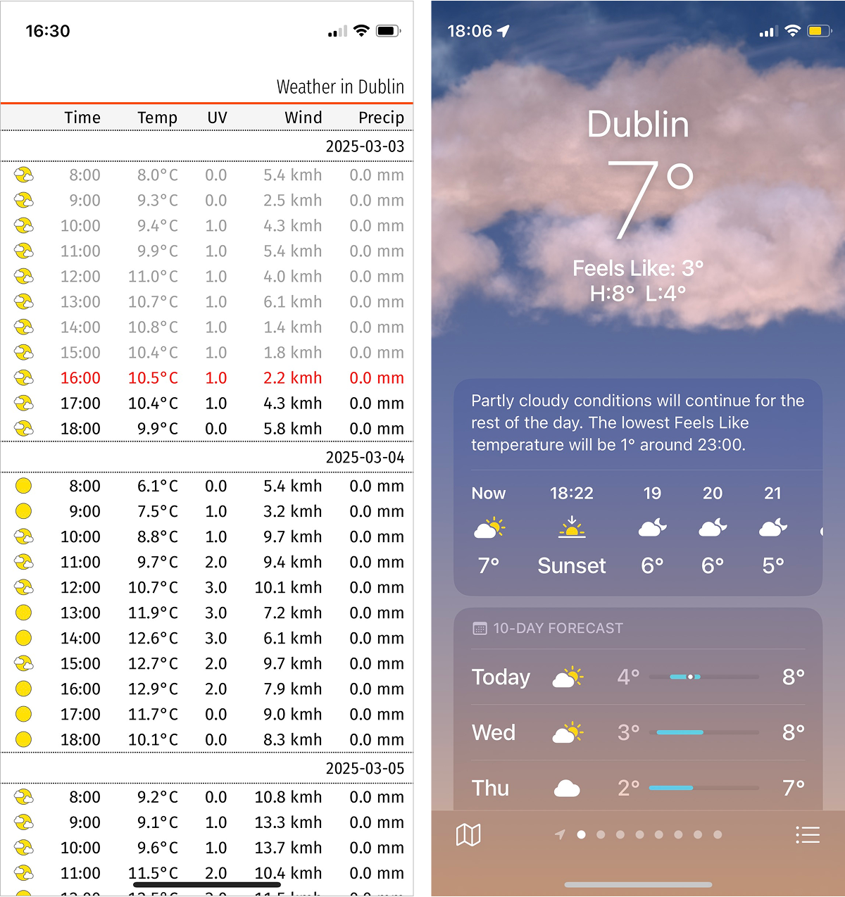
I’ve been working on a weather forecast app that presents information in a more compact form.
It’s easy to see the difference in perception when you compare the two approach side by side. You can see the entire day’s temperatures at a glance, without scrolling or tapping. The current temperature is visible but doesn’t take half the screen. A full week’s forecast is accessible with just one or two scrolls.
It’s currently available at weather.simonuvarov.com, but works for Dublin only.
It’s a Progressive Web App (PWA), meaning you can install it on your phone’s home screen. Once installed, it behaves almost like a native app, including the app icon (shown at the beginning of this post).
There’s still work to be done, but it’s so much nicer to use already.
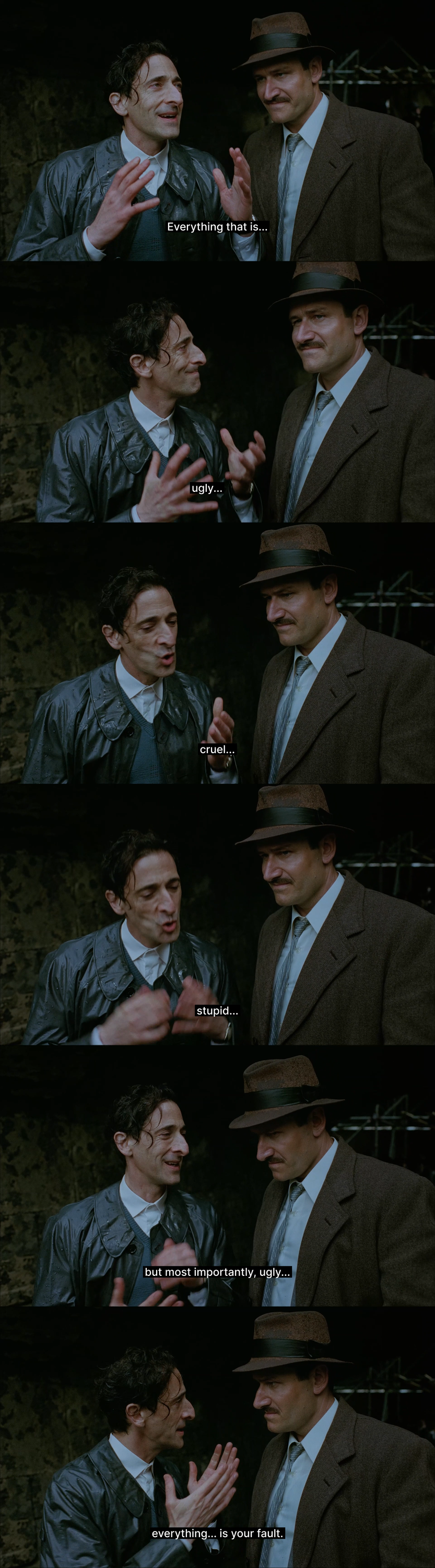
Watched Brutalist. This might be the best movie I’m going to watch in 2025.
Feynman’s Lectures Exercises 6.9
Before firing, the total momentum is:
(M+mb)V0=0
After firing one bullet, the platform moves with velocity Vp. By momentum conservation, total momentum remains zero:
MVp+mbVb=0
Solving for Vp:
Vp=−MmbVb=−0.005 m/s
A negative sign indicates the platform moves opposite to the bullet’s direction.
A bullet travels 5 m at 500 m/s, thus its travel time is:
t=5005=1001 s
Since bullets are fired every 101 s, only one bullet is airborne at a time.
Approach 1: Considering 10 bullets per second
Each bullet provides a velocity of 0.005 m/s to the platform, then it flies for some time and then it stops. In total, the platform moves for due to 10 bullets per seconds:
ttotal=nt=10×1001s=101s
Thus, the effective average velocity is:
V=0.005×101×10=5×10⁻⁴ m/s
Approach 2: Using total distance traveled
The distance traveled by the platform per bullet fired is:
sp=Vpt=0.005×1001=5×10⁻⁵ m
With 10 bullets fired each second, the effective velocity is:
V=5×10−5×10=5×10⁻⁴ m/s
Reading quotes from the book in the previous post made me think that this nightmare bicycle is the main reason design is so bad right now.
Designers confuse the simplicity of having gears with the minimalism of hiding them entirely and reducing controls to a few buttons.
A few examples:
- Avoiding tables, even when they are the best way to present dimensional data.
- Hiding important elements under menus because multiple controls in a UI are supposedly confusing.
- Prioritizing flat UI over visual structure and hierarchy.
- Using low-contrast text that sacrifices readability for aesthetics.
- Slowing down interactions with unnecessary animations and transitions in the name of “smoothness.”.
- Auto-hiding UI elements just because it looks “cleaner.”
- Implementing touch-optimized controls on desktop, such as oversized buttons and excessive whitespace.
This all comes from the desire to force certain aesthetics, and unfortunately, web technologies provide too few constraints to prevent this abuse.
From Avoid the nightmare bicycle:
Imagine a bicycle where the product manager said: “people don’t get math so we can’t have numbered gears. We need labeled buttons for gravel mode, downhill mode, …”
Good designs expose systematic structure; they lean on their users’ ability to understand this structure and apply it to new situations. We were born for this.
Finished reading Lost in Math by Sabine Hossenfelder.
This book is about Sabine being frustrated with the current state of physics and science in general. She makes a strong case for why she’s upset: many physicists devote their efforts to unfalsifiable theories, motivated purely by their aesthetic appeal.
It’s hard to deny that ideas like the multiverse and wormholes are fascinating, but if they’re closer to science fiction than science, what’s the point? Why do we invest so much time and money into theories that can never be tested or applied?
PhD stands for Philosophiae Doctor because science was once called natural philosophy. Before Newton, theories were accepted based purely on plausibility. Then came the scientific revolution, when ideas had to be tested against reality. Today, many theories are chosen solely for their mathematical beauty, making it feel as if we’ve taken a step back by a few hundred years.
I recommend this book to anyone interested in science, history of science, philosophy of science, and epistemology. It’s well-written and provides all the context needed to go through it.