The Ideal Candidate Will Be Punched in the Stomach is one of the best things I’ve read in a long time. It feels like reading Camus or Kafka set in modern times.
It’s good to see more people talking about the strange mix of apathy, anxiety, and boredom they feel. I haven’t figured out whose fault this is, but something has changed in the past ten years in how we work.
Great as always from Lucidity, Brainwash An Executive Today where he writes about how management makes decisions. I kept nodding every a few seconds, fueling my confirmation bias.
It’s such a strange world we live in. So much seems dysfunctional, even perverse — millions spent on software that barely works and hinders productivity, followed by layoffs to save on the salaries of a few engineers. And yet, some things do work — turn on a tap, and fresh water flows; flip a switch, and you draw power from a nuclear plant — how awesome is that?
I don’t know what to make of it — I’ve been struggling with it for a few years. Now, I’m coming to realize that if my expectations clash with reality, the fault is mine — I asked the world to be something it never promised to be. The only thing I can do is to seek things that work, hold to what makes sense, and let the rest pass as the wind over stone.
McMaster is a U.S. supply company with more than 700,000 products, from nails to air pumps. It might be the best example I’ve seen of how to present information to an audience.

It’d be interesting to go over the details here.
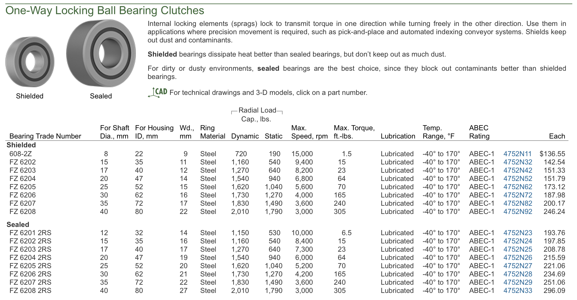
Their catalog is excellent. Each entry has both an image and text, making it easy to understand what’s inside. It strikes the perfect balance between being granular and general.

It gets even better when you click a link. Each category has an image and a short description—no fluff, just clear, concise information.

Then come the filters. Each filter has a small image, so I don’t have to waste time deciphering what OD or ID mean.
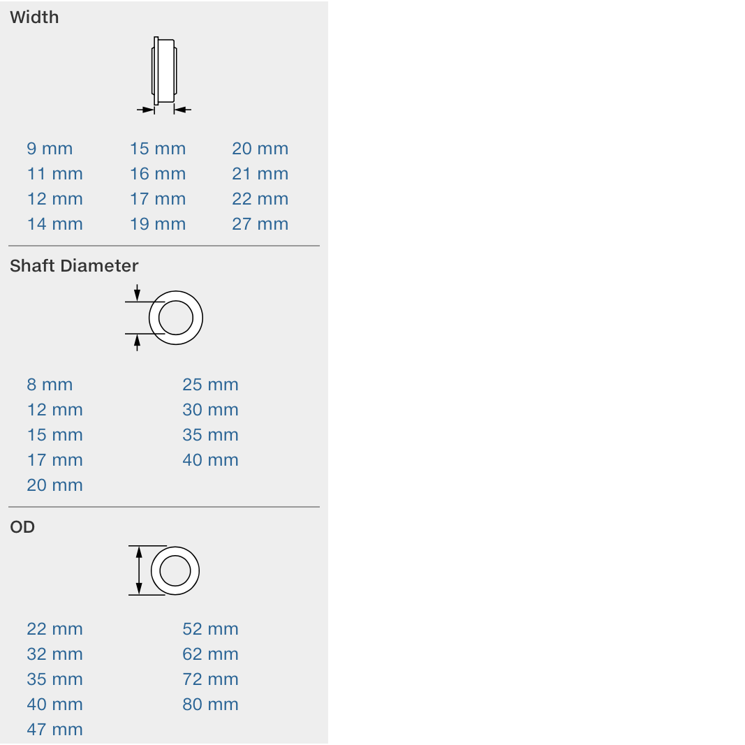
Different options are presented in a dense table, but it’s easy to navigate.
This is what most websites should aim for. People don’t need excessive white space, pop-ups, or email sign-up prompts. They need a functional website where they can quickly find and order what they need.
Apparently, Moria loves dishwashers. She climbs onto the countertop and just lies there. To distract her, I’ve started playing dishwasher sounds on Spotify. Spotify Wrapped is going to be hilarious.
Designed a logo and made it use P3 gamut following this guide. Makes a huge difference on displays that support it.
:root {
    --bright-green: rgb(0, 255, 0);
}

@supports (color: color(display-p3 1 1 1)) {
    :root {
        --bright-green: color(display-p3 0 1 0);
    }
}
From Incentives as selection effects:
“Show me the incentives, I’ll show you the outcome.” We take that Charlie Munger quote as a truism; I think it is true but misleading. We naturally parse it as: When I apply a new incentive to a target population, that same population changes their behavior.
But in my experience, that is not what happens. Instead: When you apply a new incentive, you select for a new population that prefers the incentive.
From Nobody Cares:
The one place in the world you get this vibe is probably Japan. Most people just really care. Patrick McKenzie refers to this as the will to have nice things. Japan has it, and the US mostly does not.
The will to have nice things perfectly captures why I resent some countries and adore others.