It’s been almost two months since I bought Feynman’s exercises. I didn’t expect physics to capture my attention this much. I’ve finished six chapters and created 200 new Mochi cards since then.
The exercises turned out to be the key to understanding. There were many times when I read a chapter, thought I understood it, but then found myself lost when trying to solve a practical problem. There must be a reason for this phenomenon. My guess is that it’s easy to confuse familiarity with understanding. Reading gives you the sense of the tools you can use, but it doesn’t teach you how to use them.
Doing exercises highlighted how much I’ve forgotten from mathematics. As a refresher, I skimmed through Lang’s Basic Mathematics. I started going through Spivak’s Calculus, which has even more exercises than the Feynman’s books.
This experience makes me wonder how it’s possible to cover everything in university. Sometimes I spend days thinking about a single problem. I don’t know if you can afford that when you have other subjects to study.
We just returned from Turkey, where we spent a week on a sailing boat and added the first 175 miles to our logbooks.
This might be the best vacation I’ve ever had. I’ve been thinking about what made it so, and the answer seems to be that sailing is wonderfully unpredictable. With few specific arrangements beyond where you’ll dock, it felt more like an adventure than a traditional vacation. The best trips I’ve taken have been like this.
I’m still working through the exercises to the Feynman’s Lectures. There are 36 of them to the Chapter 4! Doing exercises turned out to be the best way to understand something. I want to move forward faster with lectures and I have to stop myself constantly. It’s easy to fool yourself and think you understand the material after reading a lecture, only I open a new exercise and realize that there are gaps.
Mochi helps a lot. It’s surprising that this isn’t taught in schools and universities. Spaced repetition might be the only reliable and proven way to enhance memory. As Michael Nilsen says, “Anki makes memory a choice, rather than a haphazard event, to be left to chance.” It feels like superpower.
Movies watched
First Man. Damien Chazelle brought depth to the story and focused on personal drama, stepping away from all the stories surrounding a well-known person.
Oppenheimer. I rewatched it again with subtitles this time. It was better. Still, this movie lacks complexity and depth.
Flow. An indie animation without any dialogues and with interesting style (probably shaped by its budget).
The Wild Robot. As someone on Letterboxd put it, “the best Pixar cartoon was made by Dreamworks”. It’s an overstatement, but it’s a good cartoon.
Reading
Finished reading Bullshit Jobs. It resonated with my thoughts that many modern jobs are mind-numbing, and many more make the world a worse place. Still, it was quite repetitive and could’ve been half its size.
Dropped The Invention of Science after a few chapters. This turned out not to be a history of inventions, but more a philosophical work on how that was happening — how people talked and thought about it. It might be good, but it wasn’t what I expected.
Currently reading The Life of Isaac Newton, which has been good so far.
The easiest way to solve 2.19 (Plank Weight Trough)
A plank of weight W and length 3R lies in a smooth circular trough of radius R. At one end of the plank is a weight W/2. Calculate the angle θ at which the plank lies when it is in equilibrium.
Since the plank is in equilibrium, it must be at its lowest possible position. This means the center of mass of the plank lies directly below the center of the trough.
We can calculate the center of mass c given the length of the plank L=3R:
c=1.5W1(2WL+2WL)=1.5L=1.53R=32R
Since c forms the hypotenuse from the left point of contact to the vertical line beneath the trough center, we have:
Solving 2.17 and 2.18 Using the Principle of Virtual Work
It is possible to solve 2.17 and 2.18 using torques, but since the chapter was about using the virtual work principle, let’s use it.
Let’s consider the ladder from the exercise 2.18 (2.17 uses similar approach) rotating clockwise due to the reactive force of the wall.
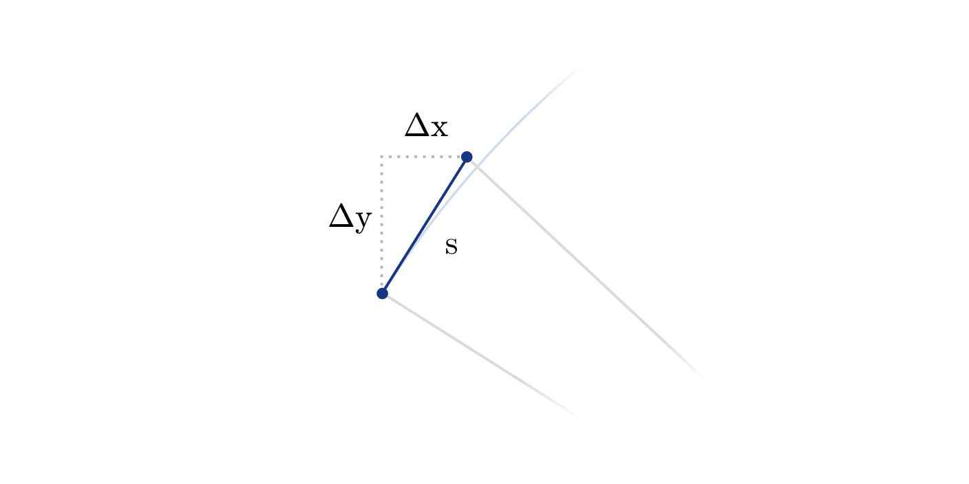
Let’s imagine a ladder rotating clockwise under the influence of the reaction force of the wall. As the ladder rotates by a small angle δθ radians, it displaces a distance s=δθ⋅r (by the definition of a radian).
For a small angle θ, it is possible to approximate that any point on ladder moves in a straight line, not in a circular path (see figure below).
This linear movement allows us to compute displacement of each point on the ladder as the following:
ΔxΔy=ssinθ=δθ⋅r⋅sinθ=scosθ=δθ⋅r⋅cosθ
Now we can calculate the work done by a reactive force of the wall T:
WT=T(δθ⋅L⋅sinθ)
Changes in potential energies of the weight W and the ladder ω are:
EWEω=(δθ⋅0.75L⋅cosθ)⋅W=(δθ⋅0.5L⋅cosθ)⋅ω
Equating the work done by T to the total change in potential energy yields:
I spent more time on this exercise than needed because I didn’t notice that the masses are equal. Otherwise, the application of the virtual work principle is straightforward.
The work is done by the gravitation force and the force accelerates the entire system, that is M=m1+m2=2m.
Let’s use the positive sign the direction of gravity acting on m2.
The work can be calculate as:
W=FΔs=Ma⋅Δs=Ma⋅Δy2=2m⋅Δy2
This work is equal to the change of the potential energy in the system as follows: