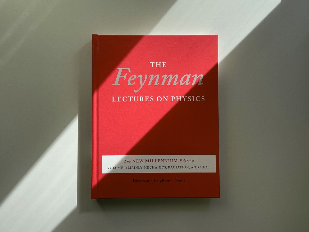
I finally bought the Feynman Lectures on Physics, something I wanted to do for a very long time. Ever since reading You’re Surely Joking Mr. Feynman. After watching some of his interviews on YouTube and going through a few chapters online, I realized there’s something special about how Feynman explains things. He doesn’t just teach formulas — he teaches understanding. Once you grasp that, you realize what true understanding is. Here are a few quotes from the introduction to the New Millennium edition:
It was like going to church. The lectures were a transformational experience, the experience of a lifetime, probably the most important thing I got from Caltech. I was a biology major but Feynman’s lectures stand out as a high point in my undergraduate experience … though I must admit I couldn’t do the homework at the time and I hardly turned any of it in. I was among the least promising of students in this course, and I never missed a lecture. … I remember and can still feel Feynman’s joy of discovery. … His lectures had an … emotional impact that was probably lost in the printed Lectures.
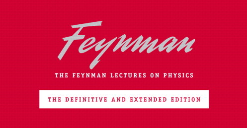
The book is beautiful. I don’t choose books solely on looks, but when there are different options, it’s better to go for the one you like. I’ve noticed that this works for anything — if I like something that’s part of an activity, I’m more likely to engage with it. So, in that sense, it is rational to choose a book by its cover. One sad thing is the lettering from the original edition has been lost in the New Millennium version:
Lettering from the original title has been lost in the New Millennium edition
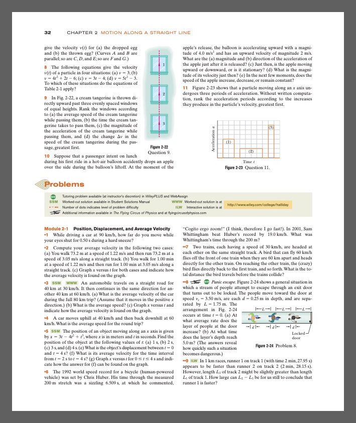
Almost all other popular physics books look very average. Compare another popular textbook with the austere design of Feynman’s lectures:
A page from another textbook on physics
My plan is to work through all three volumes over the winter and solve all the exercises from the companion workbook. I will buy a refresher for math once I hit a wall. There are a few books I have in mind: Spivak’s Calculus and The Princeton Companion to Applied Mathematics. Both are as beautifully designed as Feynman’s lectures.
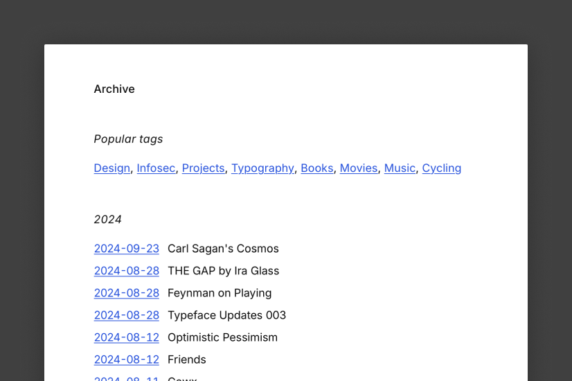
Made a few changes to the site, and now I can have posts without titles. It gives a sense of freedom, similar to what you might have unconsciously experienced on Twitter. Having a title adds a layer of seriousness to a post.
The Archive layout has changed to accommodate missing titles — now the dates link to posts, and the dates are in ISO format set in tabular figures for proper alignment.
With each iteration, it’s becoming more brutalist, and I like it.
I found King Creosote randomly through some recommendation on YouTube or Spotify — I don’t remember. Diamond Mine is now the first album I bought in a very long time. Then, I found this tender documentary about life in Scotland and loved it.
These albums are so good at grounding you. You might sit in a train or walk through a busy street, and you start forgetting that you’re part of this crowd. You feel as if you’re a bystander, noticing all the small details in people and things around you — everything that makes them special.
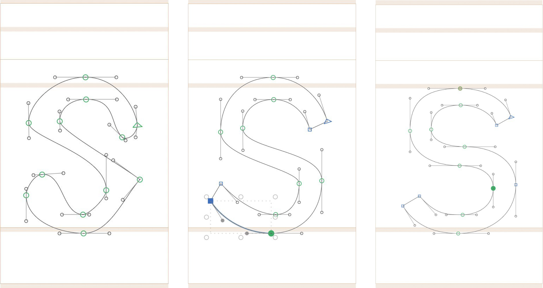
I’ve started drawing my first font. It’s the perfect pastime activity — you massage letters until they start looking good. It’s soothing.
What the process looks like
There’s no end goal besides drawing something that I could use for my website. This means I don’t need to think about covering all the glyphs — the basic Latin alphabet would be enough. I’m not even using italics here.
It feels weird not to know the scale, for example, what cap height or x-height to choose. Most of the time, it feels like “I don’t know what I’m doing”. But this is a good feeling because I haven’t felt “stupid” for a while. When you design something for the web, you at least keep your knowledge from using HTML and CSS, so you know the scale. Here’s the medium is new.
For now, I want to push as far as I can without thinking about the font metrics and edit the letters later. It means that I will need to do double work, but it allows me to focus on mastering the tool first.
Finally watched Carl Sagan’s Cosmos, a TV series produced in the 1980s. I don’t think there are many people like Carl Sagan. The show he created is so delicate, with many complex emotions. It’s captivating, fun, sad, and melancholic. The original music was composed by Vangelis, and it’s hard to imagine how it could be better.
We’re now rewatching the sequel by one of his students — Neil deGrasse Tyson. While it covers similar topics and has better graphics, it feels a little shallower.