I’ve put together a little interactive demo on variable fonts where the font’s weight and optical size change when you move your mouse around. It’s easier to see how the letter shapes adapt to the changes. Notice how the letters “open up” when the optical size decreases and how the stroke thickness varies unevenly when the weight changes.
One interesting thing I noticed while playing with it is how cool it feels when your actions and their results are coupled. When you work with a computer, your thoughts and actions are translated into a series of discrete steps. You type a letter, create a rectangle, or open a tab. This is not how we communicate with objects in real life. But this example feels closer to how you drive a car or play a musical instrument.
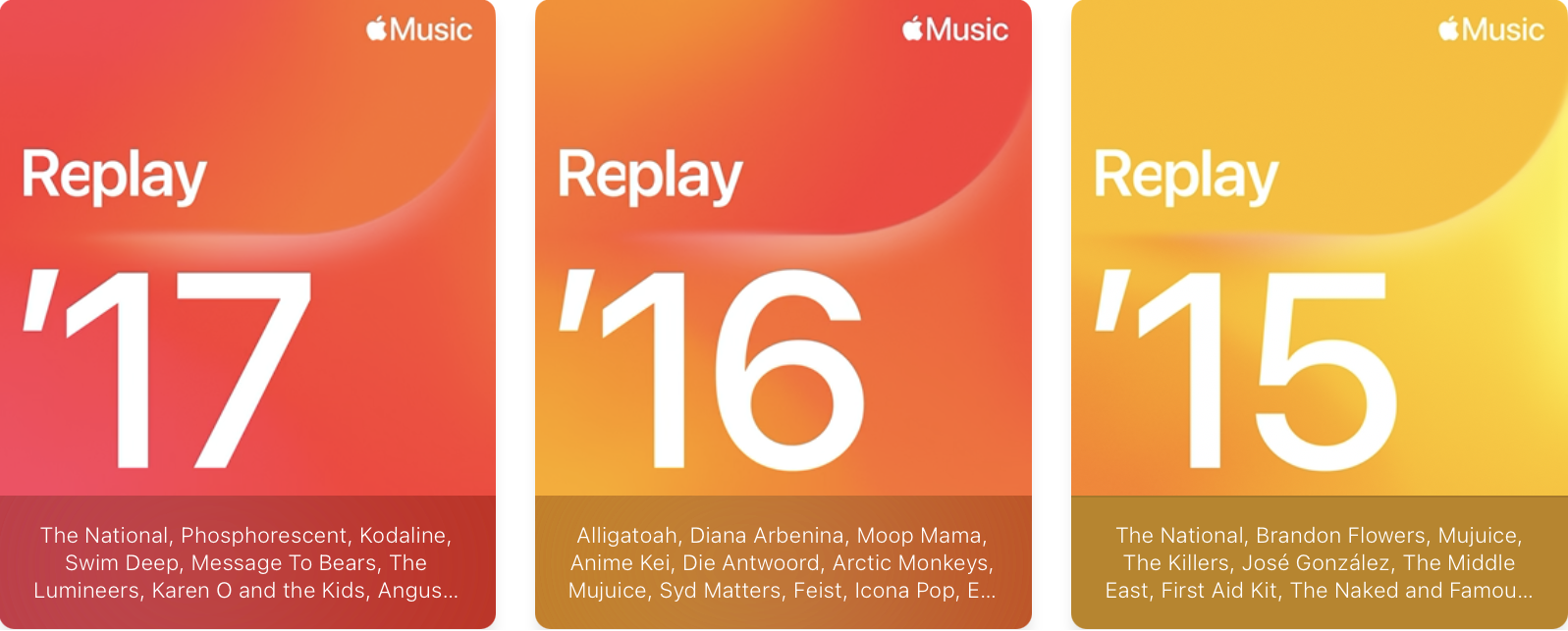
I used Apple Music in the 2010s then switched to Spotify and I used Spotify for a few years. Recently, Spotify made a fewcontroversial product decisions, nudging me to switch back to Apple Music.
After renewing my Apple Music subscription and logging into my account, I discovered that my song collection was missing. Since Apple Music recommended me songs based on what I played a few years ago and because I could still see my Replay playlists from the past years, I was hoping that my library will eventually resync. So I kept using Apple Music anyway because I thought it was a glitch.
A few months passed with no change, so I contacted Apple support. They told me that this was intentional, citing a clause on their support website:
If you canceled your subscription to Apple Music or iTunes Match, your music library is removed on all of your devices except for the device your music library is stored on. Any music, including playlists, that you added or downloaded from the Apple Music catalog is also removed.
Thus, Apple deletes your library after a few months after you cancel your subscription.
This was unexpected and, frankly, ridiculous. I can’t find any justification for this user experience. Even if licensing rights are an issue, Apple could at least preserve a file with the IDs of songs I liked and restore them when I renew my subscription.
Now I must choose between a company that holds my data hostage and a company that neglects its UX.
Realized that my life has become too data-driven. I consult ratings when I choose wine, a movie, a book. I’m surrounded by vanity metrics — likes, views, retweets — that shape what things I pay attention to. Does the fact that someone liked your post mean it’s good?
It turns out you can still buy a bottle of wine without consulting Vivino, choose a movie based on trailer/director/friend’s recommendation, and you can still write for yourself.
There’s another side of the same coin — rating things. Today, everything needs to be measured and then digitized to become real. Everything is consumed and nothing is experienced. The experience is so much richer when you don’t narrow it down to a single digit.
Redesigned my website and moved to Blot. Now it looks like a feed because I’d like to write more. When you have a list of posts, you treat them as sacred as if every one of them should be well-crafted and polished piece of work. The feeling is similar to when you buy a sketchnotebook and you’re afraid to make mistakes.
Started working on a MacOS app. This is something I’m doing for my own pleasure. Most todo apps are too complex for my needs as I need something as simple a piece of paper sitting in the menu bar. Small desktop apps give you the scale that is easy to reason about. They provide closure when you finish them.
So far, the hardest part was all the plumbing I needed to do to make something nice in SwiftUI. It gets easier once you learn all the needed patterns.
Watched some nice movies. Rewatched a few Harry Potter movies over the christmas holidays and then I watched mostly european cinema. Some notable mentions are below.
The Great Beauty by Paolo Sorrentino. It’s one of those movies that captures “feelings” instead of relying on a plot. You don’t watch it, you experience it.
Mr. Nobody by Jaco Van Dormael. Sometimes you get the feeling that it’s the right time to watch something. It was that time. It might feel like Mr. Nobody is a “cheap” movie as it has popular topics such as the chaos theory and the butterfly effect, and it stars Jared Leto. But if you look behind the things that might make it popular among general population, it has many hidden layers. And it’s so much pleasure to watch it again and again.
Triangle of Sadness and Force Majeure by Ruben Östlund. These were good. Seeing longer shots feels like novelty today, and Ruben Östlund gives you enough time to feel awkwardness of anything happenning on the screen. Also something I liked — once you think you know what he tries to say, he turns it upside down in the next scene. Possibly, Ruben Östlund got frustrated with the modern world so he just makes fun of everything.
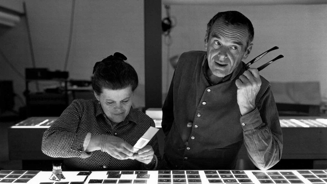
The book is collection of letters, notes, speeches, articles from and about Charles and Ray Eames. Completing this book was unexpectedly bittersweet. It felt as though I had lived alongside these two wonderful people, immersed in their ideas.
While this book is mainly about the Eames family and their work, it can offer so much more. For me, it’s a book about philosophy of design. If you ever wondered how to unite form and function or what a good design means, then this book might be for you.
Many times they were able to capture the essence of what I believe in but don’t have words for. Below are some of the pieces I liked the most.
The first step in design, that of determining the need, is a very hazardous undertaking. It is not simple, even the most sincere can easily confuse the actual need with the traditional idea of need and be led off on a hopeless tangent.
I liked the following short piece because I’ve been thinking the same for long. You can’t just close your laptop and stop being a designer. The designer’s approach to problem solving permeates his life. I don’t know how it can be otherwise.
Design is a full time job.
The next one is interesting because Herman Miller and Vitra (who are official distrubutor of Eames furniture in the US and Europe) price and sell their furniture as luxury items. One can even argue that replicas are closer to the original than what Herman Miller and Vitra sell now.
The objective is the simple thing of getting the best to the greatest number of people for the least.
These ones on copying.
Now, you may reuse something else, but if you do it sort of knowingly, as the best solution of that problem as you see it at the time, it’s not a cliche. And anyone who would avoid using something just because it has been used before would be knowingly not creating the best solution, if in his mind he knew it was the best thing to do and he was not doing it because he knew it had been done before.
It would be nice if people improved on a piece of furniture when set out to copy it. Unfortunately, they are not usually concerned with quality.
On creativity in design.
To my mind crafts seem to suffer more from overdoses of originality in design rather than from lack of this.
And on the design process.
The idea of design as a development of progressive sketches is romantic and not very accurate.
It is more an optimizing process that is apt to start from a series of hunches which are either developed or discared by purely intellectual means long before any skethch or model is made.
When these hunches finally begin to combine in such a way that they seem to satisfy more aspect of the problem than any one has a right to expect, then this is the beginning of a concept.
When the concept is formed it represents about 5 percent of the design effort — the remaining 95 percent of the effort being used to keep the concept from falling apart.
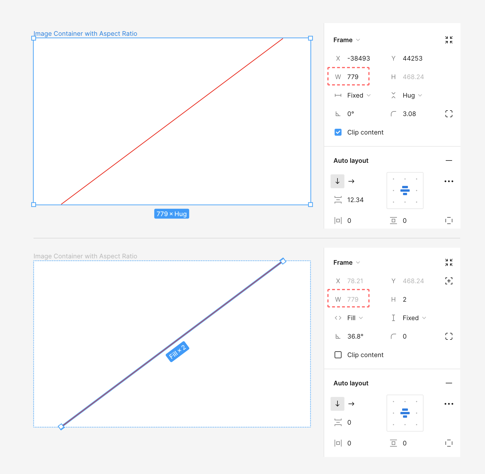
Figma doesn’t have a built-in feature to set constraints for frames to support specific aspect ratios like 4:3 or 16:9. But I found a way to get around this limitation.
Here’s what you need to do:
Create two frames. The outer frame will be the image container, while the inner frame will be responsible for keeping the desired aspect ratio.
Set the outer frame’s width to either fill or fixed and its height to hug.
For the inner frame, set its width to fill and its height to 0, essentially making it invisible.
Now, rotate the inner frame by a specific angle based on the aspect ratio you want.
You can calculate this angle using the formula:
angle = arctan(height/width)
For instance, if you’re aiming for a 4:3 aspect ratio, the calculation would be:
angle = arctan(3/4) = 36.87°
Here’s the table of aspect ratios and their corresponding angles:
Aspect Ratio
Angle
1:1
45°
3:2
33.69°
4:3
36.87°
16:9
29.36°
2:3
56.31°
3:4
53.13°
9:16
60.64°
Why this works?
This is likely due to a bug (or perhaps a feature?) in Figma. The bug is that if you rotate a frame inside of an auto layout, its width will be set to the width of the outer container, even if it’s rotated.
The width of the inner frame stays the same even after rotation
Changing the width of the outer frame also alters the width of the inner frame, which changes the height of the inner frame, which in turn changes the height of the outer frame. The extent of these changes depends on the angle.
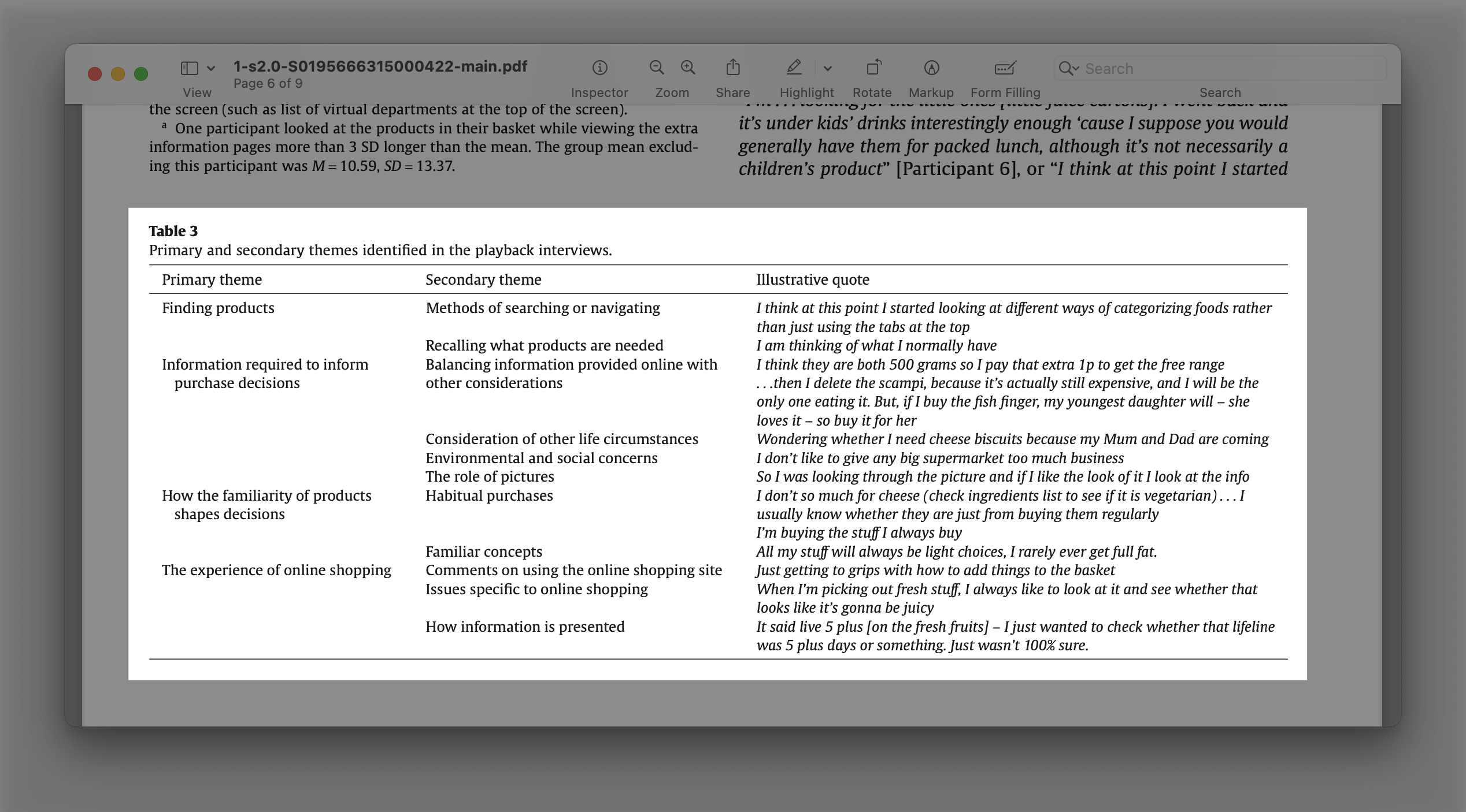
Buymie is an online grocery delivery app that has gained popularity in recent years, but it suffers from several usability issues that prevent it from fully meeting user needs.
By creating a better solution that addresses these issues, the app has the potential to increase user satisfaction and drive revenue for the business. This design case study explores the opportunity to improve the user experience and user interface of Buymie, now Dunnes.
Preview of the redesigned app
Problem and User Research
For my problem research, I talked with a few people who order groceries online. I also relied on my own experience since I’m a frequent online grocery shopper.
Combining user research, personal experience, and publicly available research findings provided a more solid foundation for making informed decisions in the light of limited data.
Research findings from the mentioned paper
Scope
Based on my research and analysis, I identified several key issues with the current app, such as confusing navigation and poor layout, limited search functionality, poor checkout process, and inconsistent branding and design.
To address these issues and improve the user experience, I focused on redesigning the main screen for navigation, the search screen, the item card screen, and the shopping cart screen.
While there are certainly other areas of the app that could be improved, I chose to prioritize these screens as they provide core functionality and can serve as the foundation for other screen designs.
Design research
I researched other applications that presented content in any form, such as online cinemas, podcasts, music on demand, and other online shopping apps. Additionally, I looked at apps that work with food, such as nutritional assistants, fitness apps, and diet apps.
Navigation
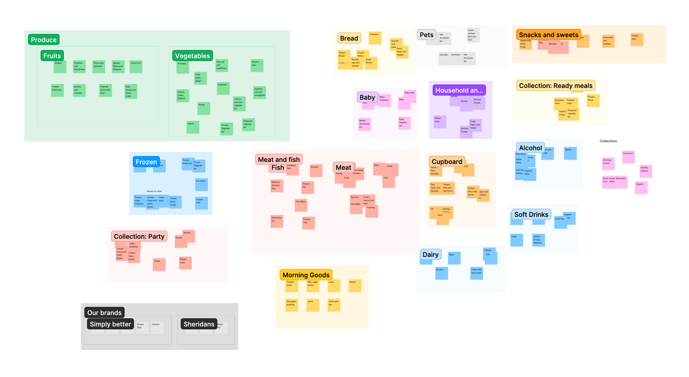
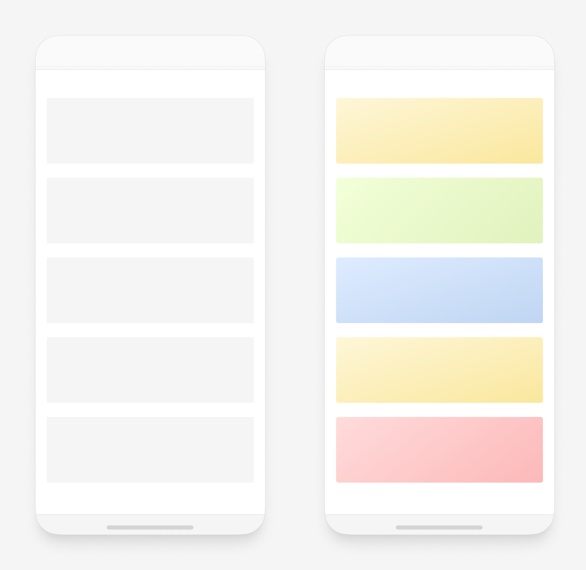
Navigation relies on recognition. So people choose to use naviation when they know the exact path to the item. To make navigation easier, I focused on placing items where people expect to find them.
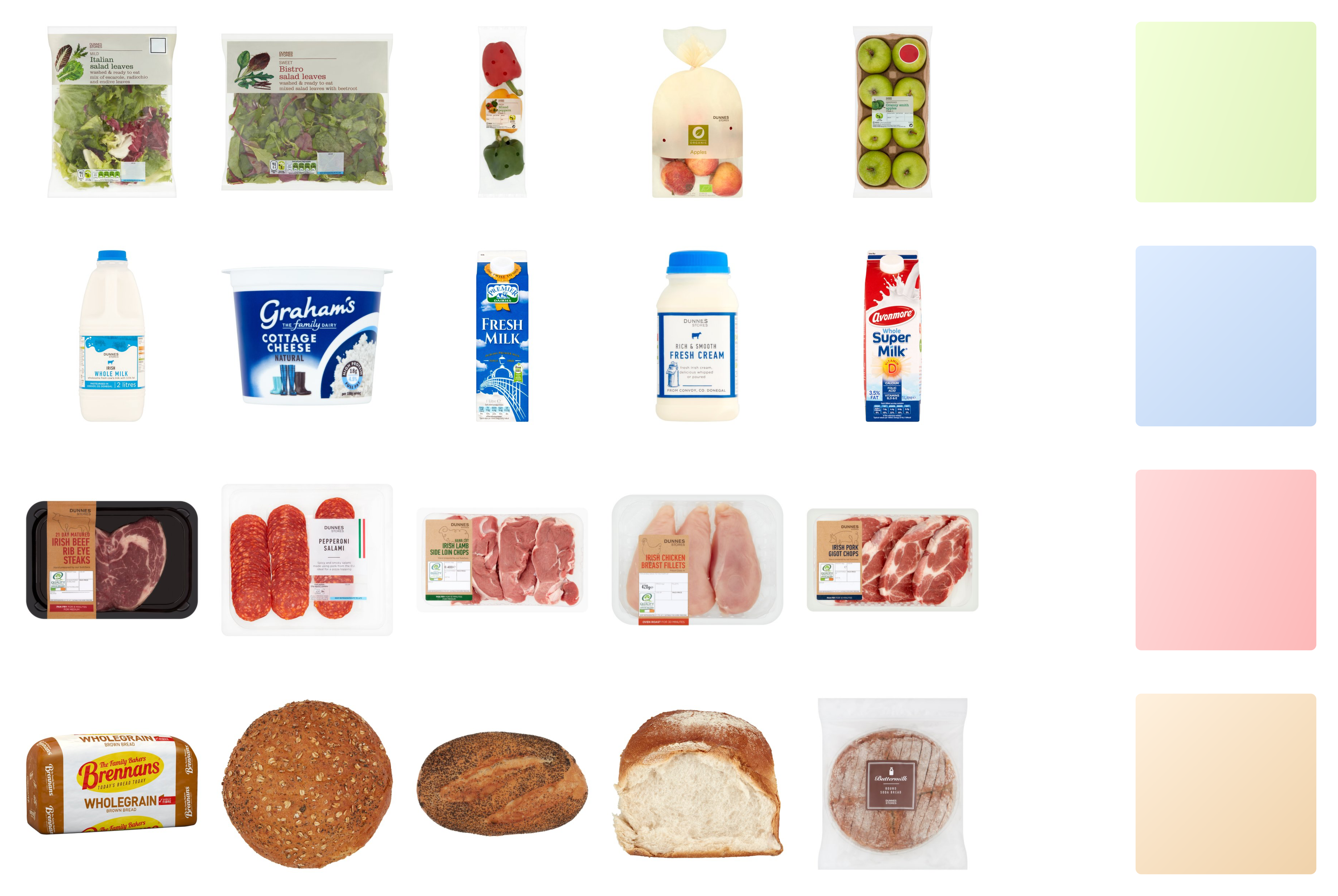
The first step was to group similar categories together. Such groups allow placing similar categories closer to each other.
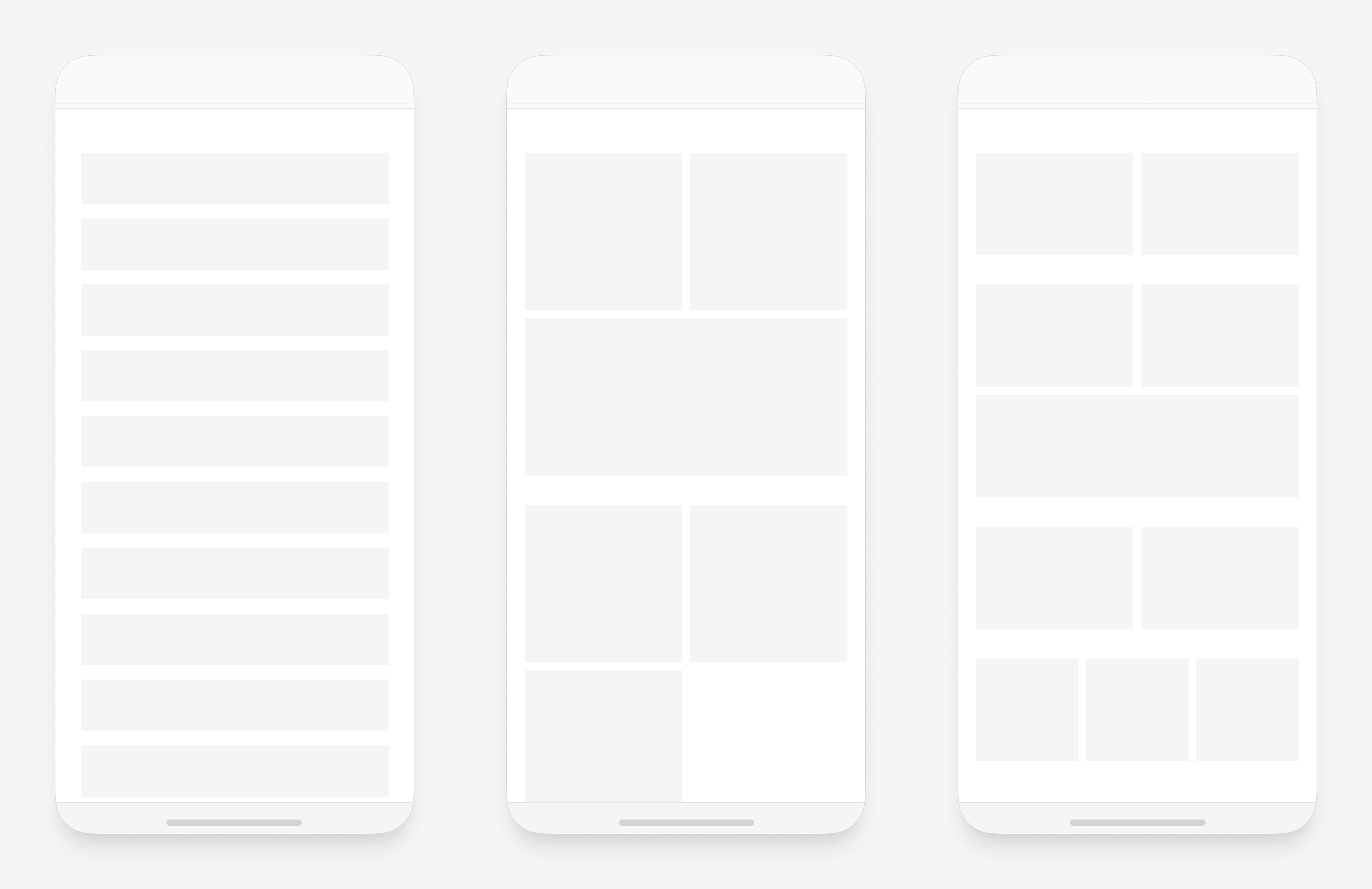
Grouped rectangular cards are more flexible and take less space than squares
To design a good navigation system, it is important to place items where people expect to find them. In the current version of the app, items are often placed according to their “true” category, which may not align with users’ mental models. To address this, I conducted a card sorting exercise to group categories together in a way that reflects how people think about them.
To aid in the recognition process, I color-coded similar categories based on people’s associations with certain colors. For example, I used blue for dairy products and red for meat. This color-coding system helps users quickly identify the categories they are looking for.
Furthermore, I considered the fact that people often purchase the same products repeatedly, so I designed the navigation to allow users to easily find and access their previous orders.
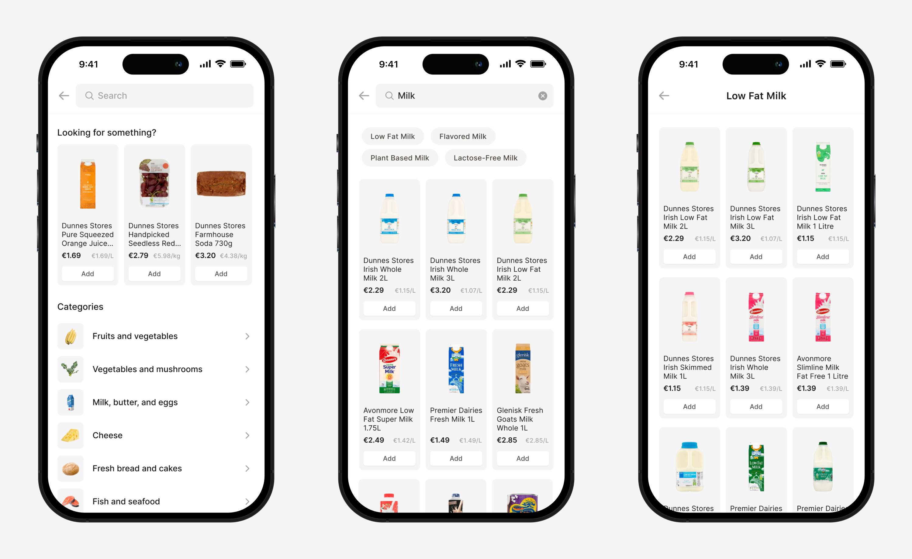
Search
Searching provides a more flexible strategy for finding items, as it allows users to reach an item using any part of the name (e.g. brand, type of product) that they happen to remember.
When people get to the search screen, they are trying to find something. It is possible to use the empty state to “predict” what they are looking for and show shortcuts.
Empty search state predicts what a person wants to accomplish and provides quick ways to do it
People also rely on search when they want to find a category by its name. If the search provides such results, then people learn these patterns and the search becomes part of the navigation system itself.
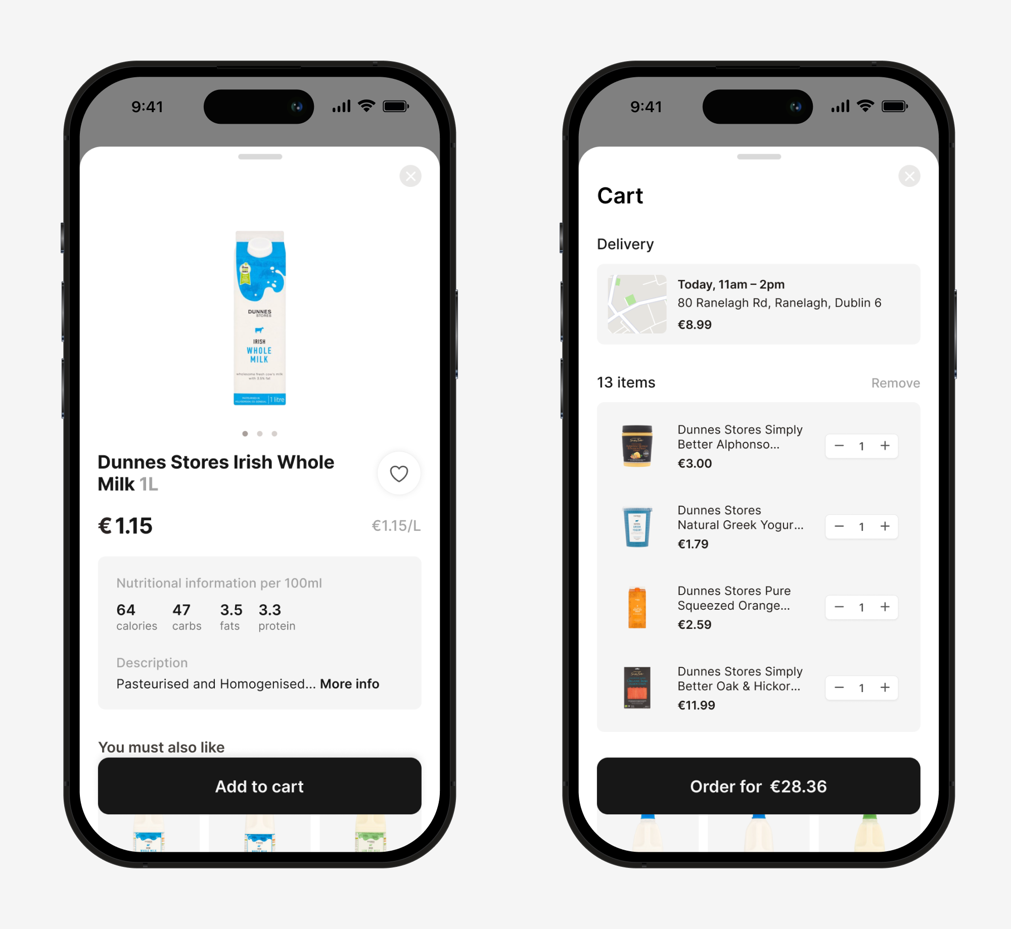
Product card and shopping cart
For the product screen, I prioritized the information based on the research. The most important information, such as product photo, price, price per kg or liter, and nutritional information, was made more visible. To enhance the user experience, the product screen is presented as a modal sheet, allowing users to easily “peek” at the product information without being taken to another screen.
Similarly, for the shopping cart screen, I prioritized the information by placing the delivery address closer to the top so that it remains visible even when a user has a long list of groceries. This way, users can easily confirm their delivery address before checking out.
Conclusion
In summary, the app was redesigned to address several key issues, including confusing navigation and poor layout, limited search functionality, poor checkout process, and inconsistent branding and design.
Next steps include conducting usability testing with a small group of users to gather feedback and make any necessary adjustments before launching the updated app. Additionally, ongoing monitoring of user feedback and behavior will inform future updates to continue improving the app’s user experience.
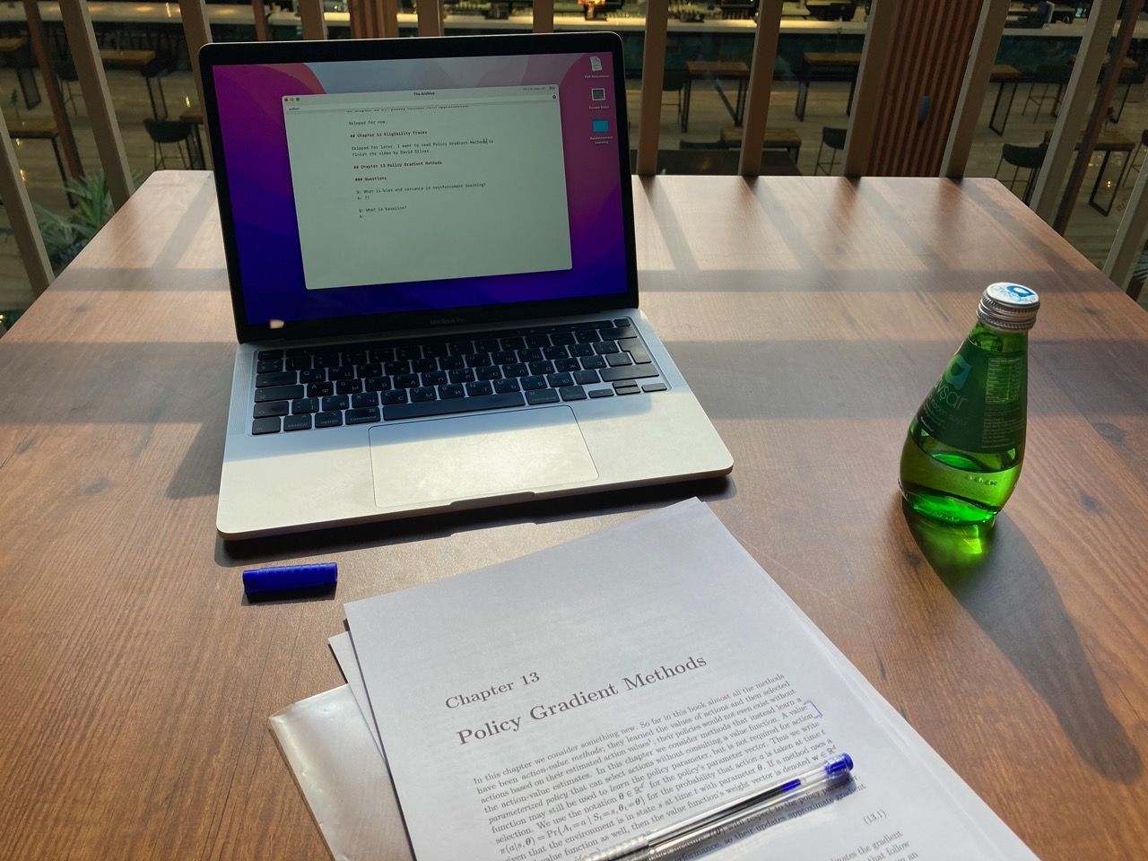
It took me more than two months to understand how these 48 lines of code work. It’s a policy-based algorithm, which means that it does not try to predict future rewards and choose actions that would produce the highest rewards. Instead, REINFORCE learns to take an action based on the current state, aiming for an optimal policy. This policy is approximated using a neural network.
The policy learns to balance the pole (starts at 20 sec)
It’s been very fun to learn about neural nets and reinforcement learning algorithms. Code implemented along the way is available at ai-playground.