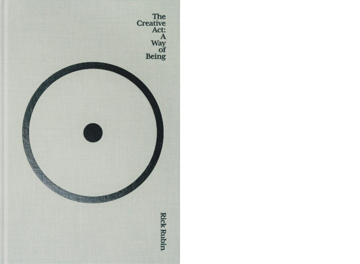
I didn’t like this book at first. At the beginning, he talks about spiritual nonsense — the Source. It didn’t make much sense then and it doesn’t make sense now. The best approach is to ignore these parts or think about them as Rick’s way to express things that he’s unable to put into words. If you survive this initial shock, you get to the good part.
The good part, and why you should read it, is all the things that you believe in and wanted to hear somebody else saying. Things that we collectively lost along the way.
We live in a messed-up world where quality is reduced to a few numbers on a dashboard or where people stopped doing what they like and started doing what drives engagement. I needed to know that there are people who still appreciate simple things and who work for themselves.
His main point is that art (read it as ”anything you do”) is about yourself. The quality of your work is what you should struggle to improve. Everything else — feedback, critique, self-doubt, motivation — is a means to the final result.
At some point in my life, I lost track of who I am — there were too many voices aroud, and too many instances where I need to conform to someone else’s opinion. This book gave me a breath of fresh air and I don’t care anymore.
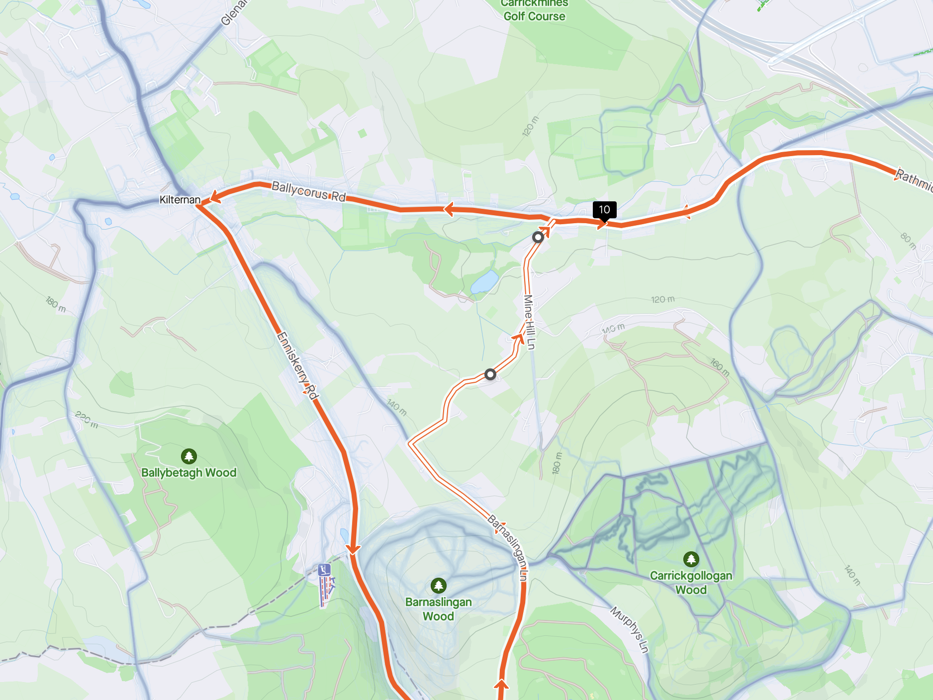
I’ve recently started using Strava to create cycling routes. I noticed that sometimes it doesn’t use some roads because the paving is not specified. In theory, you can add additional points to route through these roads, but this isn’t the best solution.
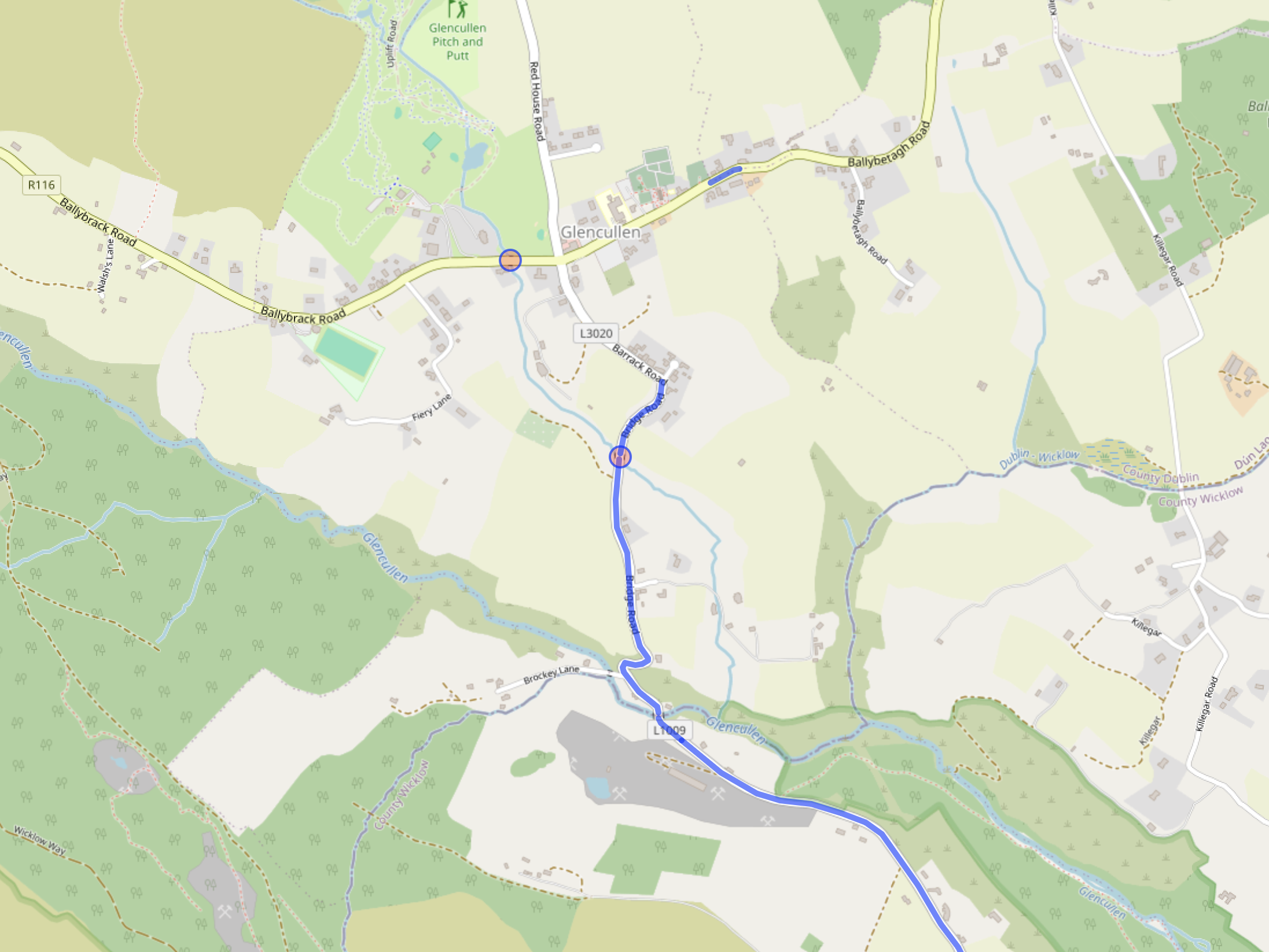
Strava highlights roads with “unspecified” surface in white
Strava uses Mapbox for maps and navigation, which in turn uses OpenStreetMap data.
I wanted to know what roads didn’t have a surface type specified to adjust them in OpenStreetMap later.
I needed a way to query OpenStreetMap data. I found Overpass Turbo, which allows you to query and visualize any data from OSM.
I used this query to highlight all roads that didn’t specify their surface type:
[out:json];

(
  way[highway~"primary|secondary|tertiary|residential"]["surface"!~"."]({{bbox}});
);

out body;
>;
out skel qt;
Displaying the result of the query in Overpass Turbo
Filtering roads with a certain speed limit
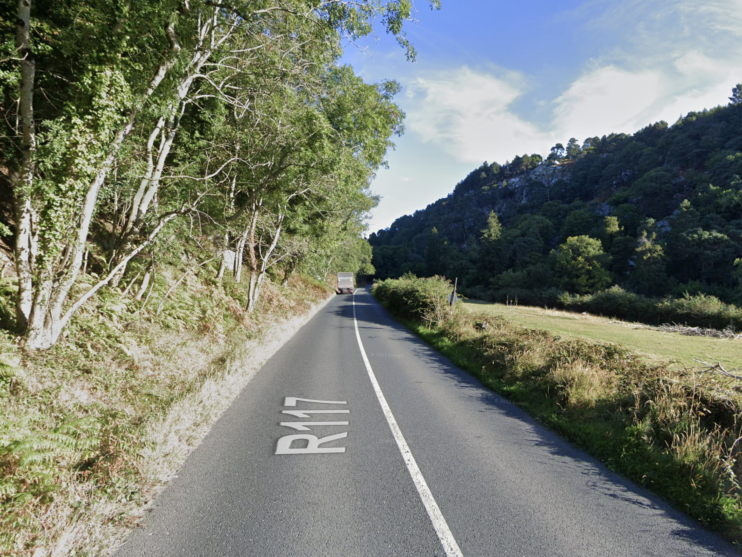
Another useful application of Turbo Pass is finding roads with certain speed limits. Scalp road is one the most beautiful roads in Ireland, but it has an 80km/h speed limit. I can only ride on it in the morning when the traffic is low. At other times, I need to find roads with lower speeds.
Scalp road
The following query can be used to highlight roads with 30-60 km/h speed limits.
I’ve designed basic glyphs of the Latin alphabet and numbers. Making them consistent in form, weight and contrast takes a lot of time.
I’m still struggling with the letter and the stroke widths. Initially, my values were too small, resulting in letters that were too narrow and too light. The letters are still too light.
I bought a few books on font design:
Designing type by Karen Cheng. Unlike most books that only touch on general topics of typography, this one goes through the design process for each letter.
Size-specific adjustements to type designs by Just Another Foundry. I’m not even close to implementing optical sizes, but it’s interesting to read, and it’s beautifully made.
I’ve also started to notice details in fonts that I previously overlooked. This might be what Ellen Lupton describes as typomania:
Introduced through the innocuous pages of a college textbook, typography will soon stalk you everywhere. You cease to find solace and sustenance at the supermarket; instead, you puzzle over the diamond-shaped tittles that dot the i’s of the Triscuit logo…
One day you step off the edge of the subway platform wondering whether the words ‘STAND BEHIND THE YELLOW LINE’ are set in Akzidenz Grotesk or Helvetica.
I first wondered why I’m doing this when there are so many Helvetica alternatives available online. But then I remembered how much joy I get from working on my font. Regardless of the many others that exist, this one will be mine.
I found this song from Bo Burnham a while ago, but I keep returning to it again and again.
When I was a kid, the internet was my way to get out and have fun. Today, the internet feels claustrophobic and stifling—a place I want to run from.
I’m still learning how to live with all this. I’ve ditched Google and am slowly abandoning all services that use auto-generated feeds. I’m returning to simple technologies — pictures stored in a folder on my computer, RSS readers, notes in text files, and my paper notebooks.
But I’m not there yet. And while I’m learning, the best thing I can do for my mental health is to laugh it all off.
Design workflows at most tech companies follow an incredible number of structured tasks: for each project, designers must create user personas, user stories, journey maps, wireframes, user interviews, and much more. However, driven by a desire from businesses to turn design into a process-heavy, measurable function, we’re filling our time with checklists instead of focusing on the very thing that makes designers relevant.
… and he’s right. People don’t think anymore. They mindlessly follow rituals, hoping to create something useful. This is how universities and bootcamps teach “design”. Check any university website, and you’ll see that it’s all about creating personas, user flow diagrams, low and high fidelity prototypes. While being useful at certain cases, they don’t gurantee “quality”.
If you look at design methodologies, most of them are created by either professors or consultants. None of these people practice product design. But they do get bonus points and money by reinventing the wheel. Design Thinking? What were people doing before Design Thinking?
He then makes another good point on the gap between designers and engineers:
For years, I’ve argued the design profession – fueled by how we educate designers – operates on outdated ideas about the separation of labor. Designers are expected to come up with the ideas, while engineers are merely there to execute them. Design stays in a corner away from technology.
The idea “I’m a designier, I don’t code” is so artificial. If you want to create good solutions, you cannot delegate understanding of technologies to other people.
In the past, designers were engineers who loved and respected computers. Today, it’s rare to find a designer who genuinely enjoy creating software.
Focus on better, not on newer. Why are we obsessed with the new? We should be obsessed with better. That is what drives us at Vitsœ. After all, it is the way that the natural world operates: constantly improving, not launching new species.
Every company, every movie director, everyone tries to create something new. Very few people try to make something better. Many forgot that creating new is not the goal, it’s a byproduct of creating something good.
Maybe it has always been like this. People create new things, it’s our nature. Still, it feels today time between fashion trends is narrower.
Creating new things for the sake of being new not only brings shallowness, it also deteriorates the quality of what we already have. We destroy what has been done before and instead fill our world with novel inferiority.
Quality work requires patience, contemplation and deep thought. In the race to “innovate”, there’s little time left to pause and reflect.