Font Updates 001
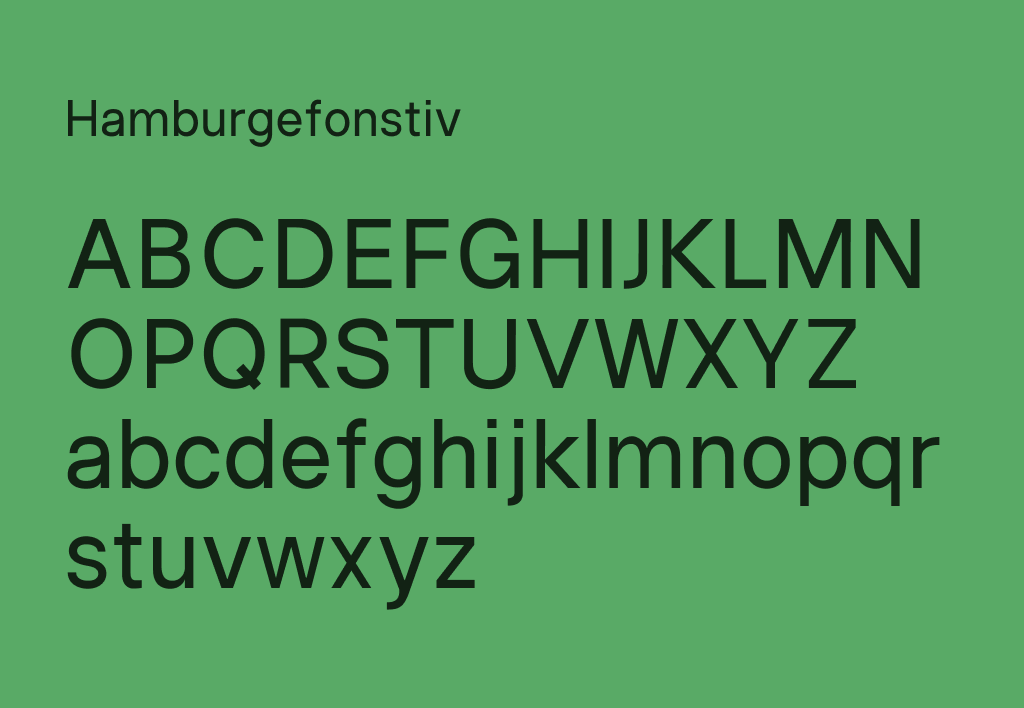
I’ve designed basic glyphs of the Latin alphabet and numbers. Making them consistent in form, weight and contrast takes a lot of time.
I’m still struggling with the letter and the stroke widths. Initially, my values were too small, resulting in letters that were too narrow and too light. The letters are still too light.
I bought a few books on font design:
- Designing type by Karen Cheng. Unlike most books that only touch on general topics of typography, this one goes through the design process for each letter.
- Size-specific adjustements to type designs by Just Another Foundry. I’m not even close to implementing optical sizes, but it’s interesting to read, and it’s beautifully made.
- A few essay-like books from Hyphen Press — Unjustified texts, Modern typography, and Detail in typography. I first heard about this print house in Robin Rendle’s blog. These books go out of print quickly, so I wanted to own them.
I’ve also started to notice details in fonts that I previously overlooked. This might be what Ellen Lupton describes as typomania:
Introduced through the innocuous pages of a college textbook, typography will soon stalk you everywhere. You cease to find solace and sustenance at the supermarket; instead, you puzzle over the diamond-shaped tittles that dot the i’s of the Triscuit logo…
One day you step off the edge of the subway platform wondering whether the words ‘STAND BEHIND THE YELLOW LINE’ are set in Akzidenz Grotesk or Helvetica.
I first wondered why I’m doing this when there are so many Helvetica alternatives available online. But then I remembered how much joy I get from working on my font. Regardless of the many others that exist, this one will be mine.