Case-study: Dunnes
Buymie is an online grocery delivery app that has gained popularity in recent years, but it suffers from several usability issues that prevent it from fully meeting user needs.
By creating a better solution that addresses these issues, the app has the potential to increase user satisfaction and drive revenue for the business. This design case study explores the opportunity to improve the user experience and user interface of Buymie, now Dunnes.

Problem and User Research
For my problem research, I talked with a few people who order groceries online. I also relied on my own experience since I’m a frequent online grocery shopper.
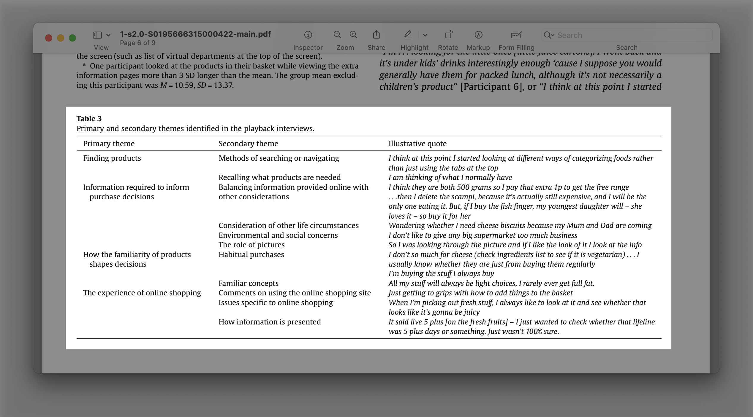
In addition, I reviewed publicly available research findings to better understand industry trends and best practices. The most interesting study was “What information do consumers consider, and how do they look for it, when shopping for groceries online?” as it provides information on how people do groceries online.
Combining user research, personal experience, and publicly available research findings provided a more solid foundation for making informed decisions in the light of limited data.
Scope
Based on my research and analysis, I identified several key issues with the current app, such as confusing navigation and poor layout, limited search functionality, poor checkout process, and inconsistent branding and design.
To address these issues and improve the user experience, I focused on redesigning the main screen for navigation, the search screen, the item card screen, and the shopping cart screen.
While there are certainly other areas of the app that could be improved, I chose to prioritize these screens as they provide core functionality and can serve as the foundation for other screen designs.
Design research
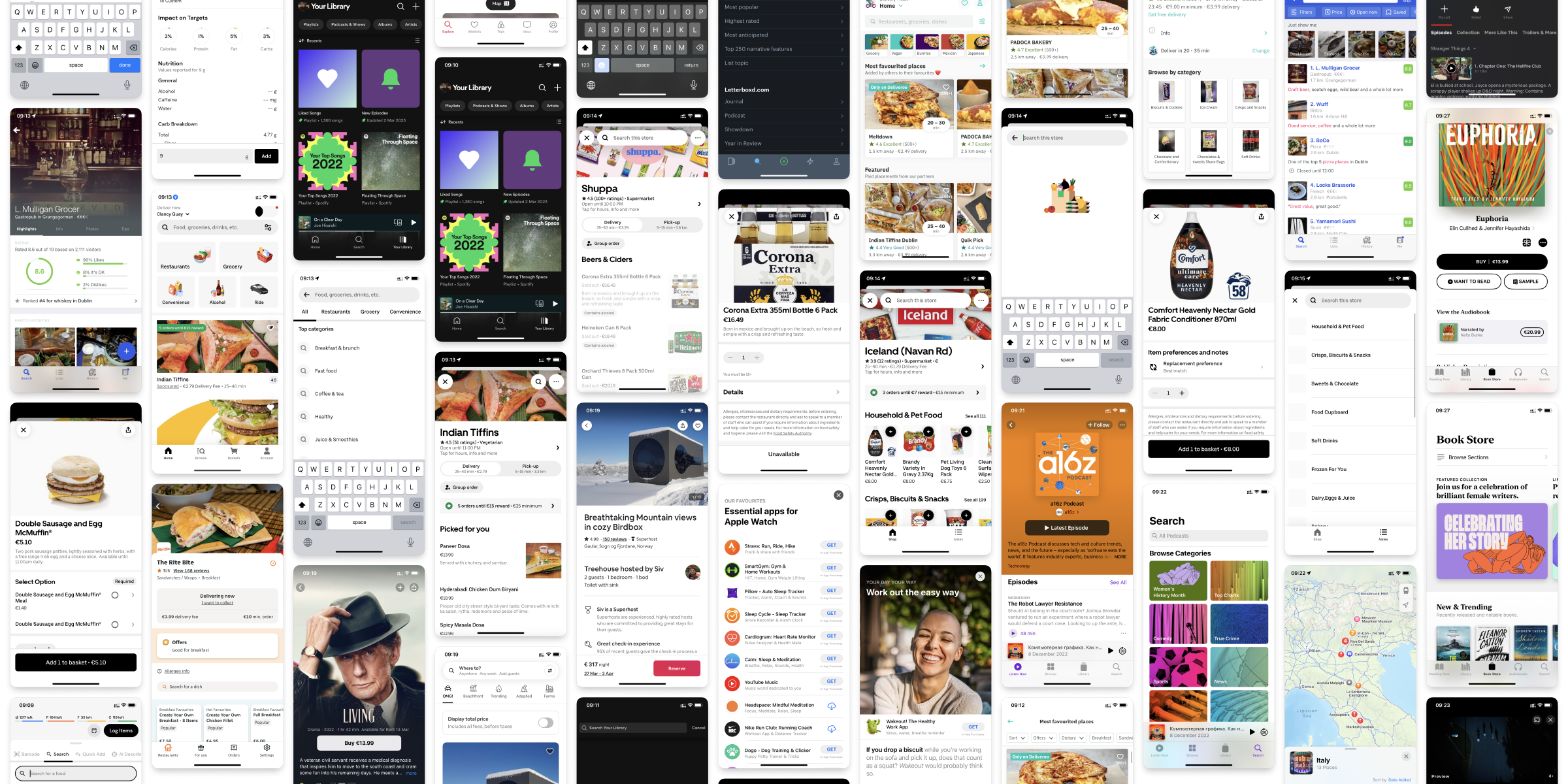
I researched other applications that presented content in any form, such as online cinemas, podcasts, music on demand, and other online shopping apps. Additionally, I looked at apps that work with food, such as nutritional assistants, fitness apps, and diet apps.
Navigation
Navigation relies on recognition. So people choose to use naviation when they know the exact path to the item. To make navigation easier, I focused on placing items where people expect to find them.
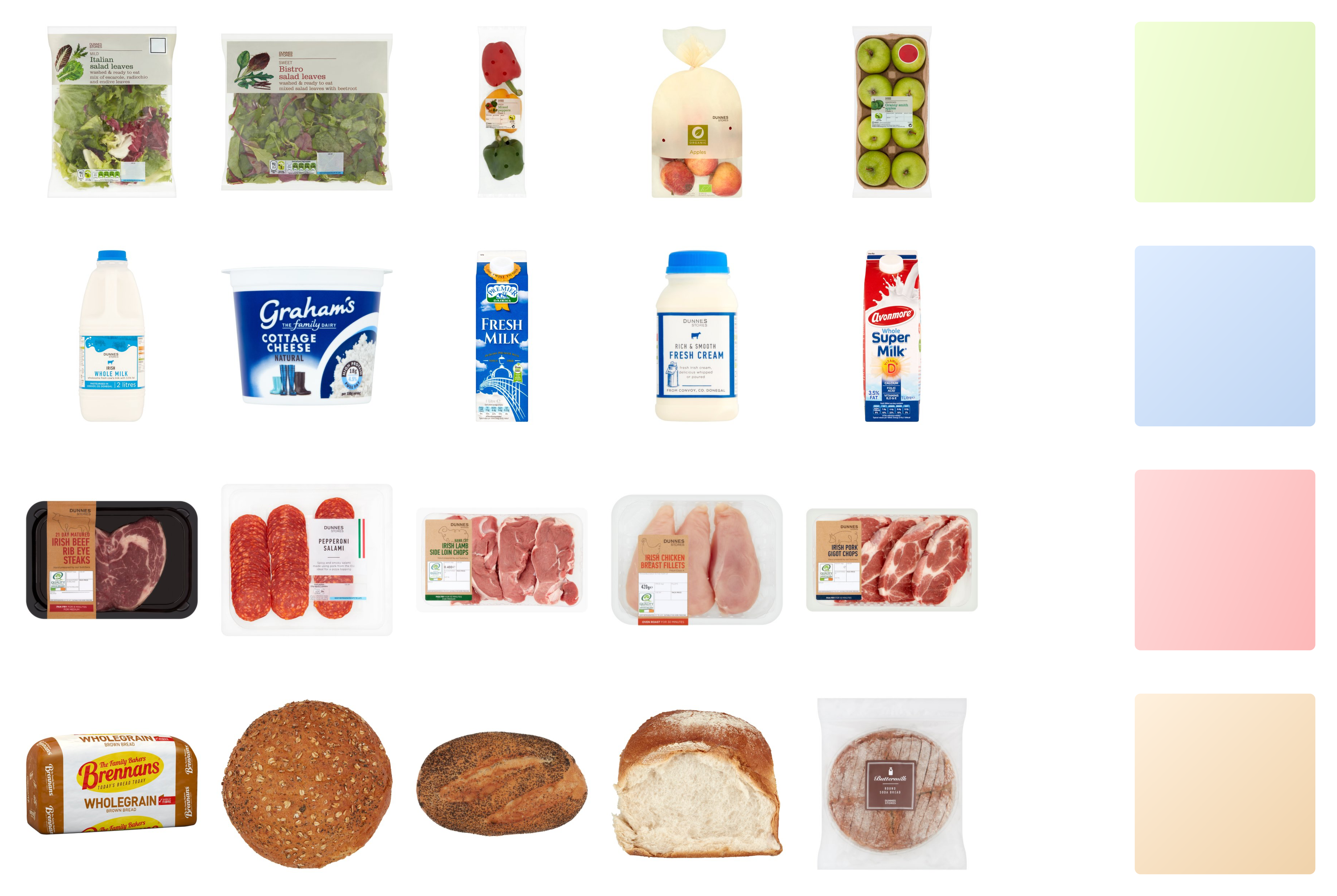
The first step was to group similar categories together. Such groups allow placing similar categories closer to each other.
To design a good navigation system, it is important to place items where people expect to find them. In the current version of the app, items are often placed according to their “true” category, which may not align with users’ mental models. To address this, I conducted a card sorting exercise to group categories together in a way that reflects how people think about them.
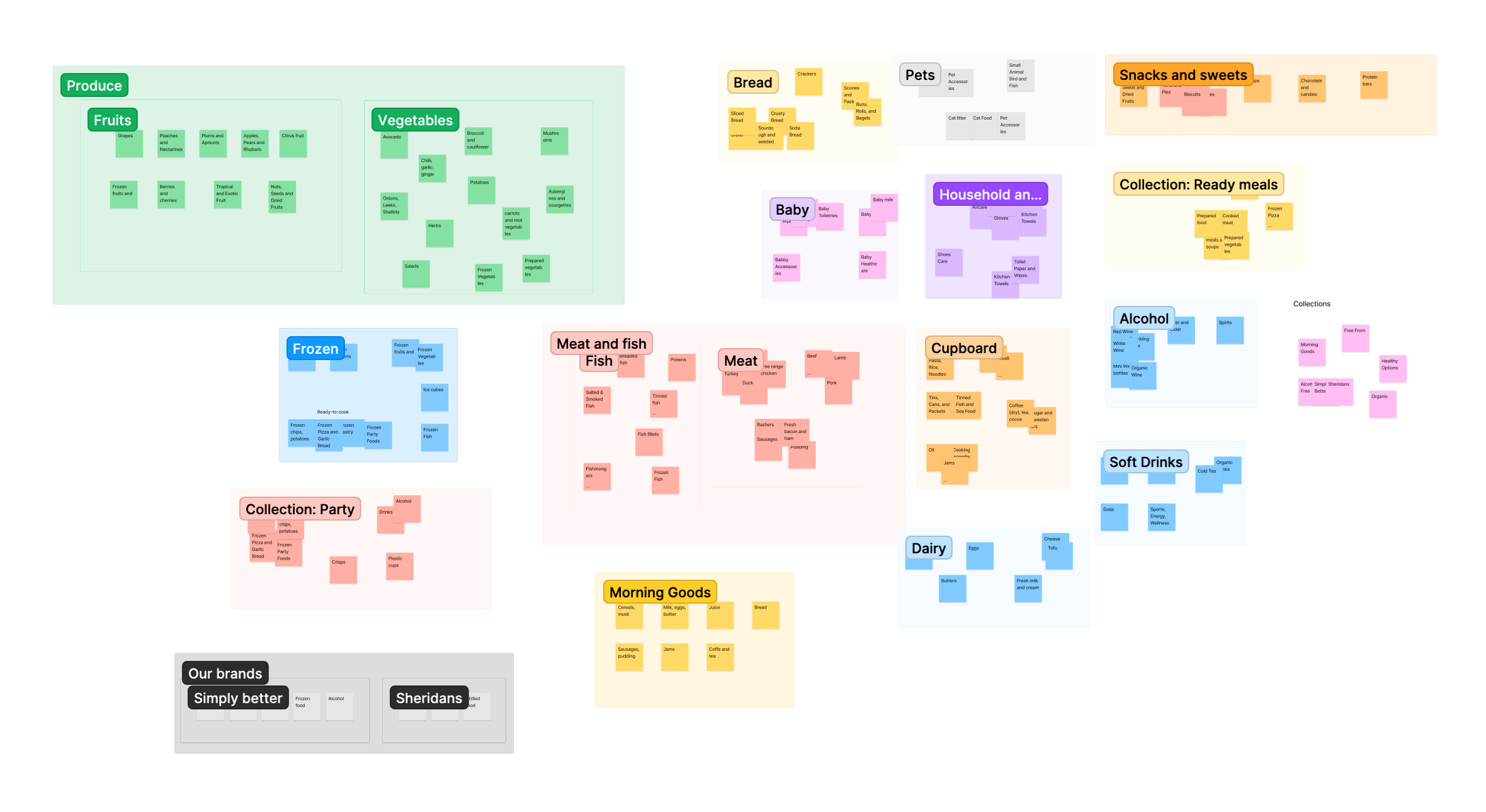
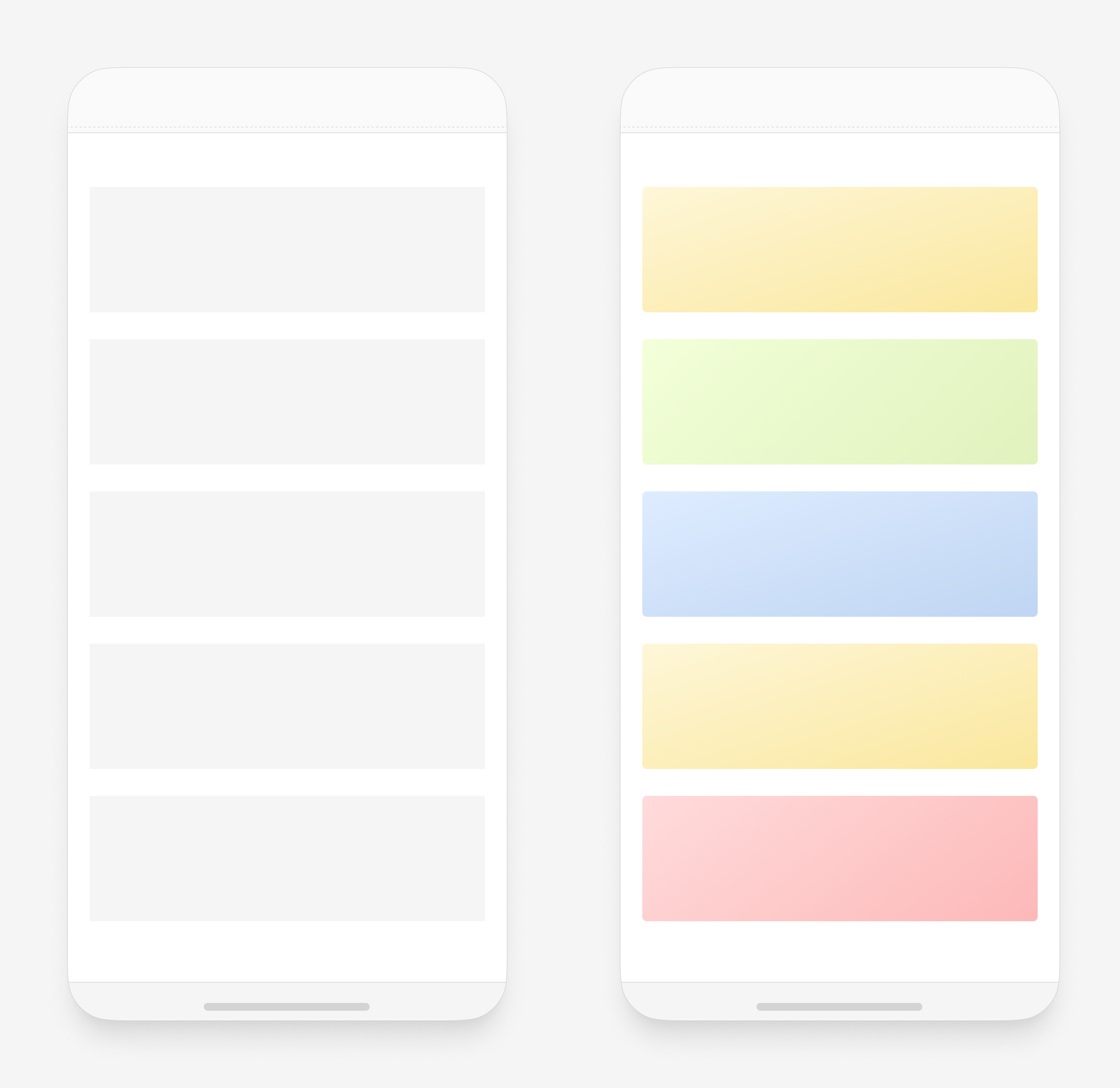
To aid in the recognition process, I color-coded similar categories based on people’s associations with certain colors. For example, I used blue for dairy products and red for meat. This color-coding system helps users quickly identify the categories they are looking for.
Furthermore, I considered the fact that people often purchase the same products repeatedly, so I designed the navigation to allow users to easily find and access their previous orders.
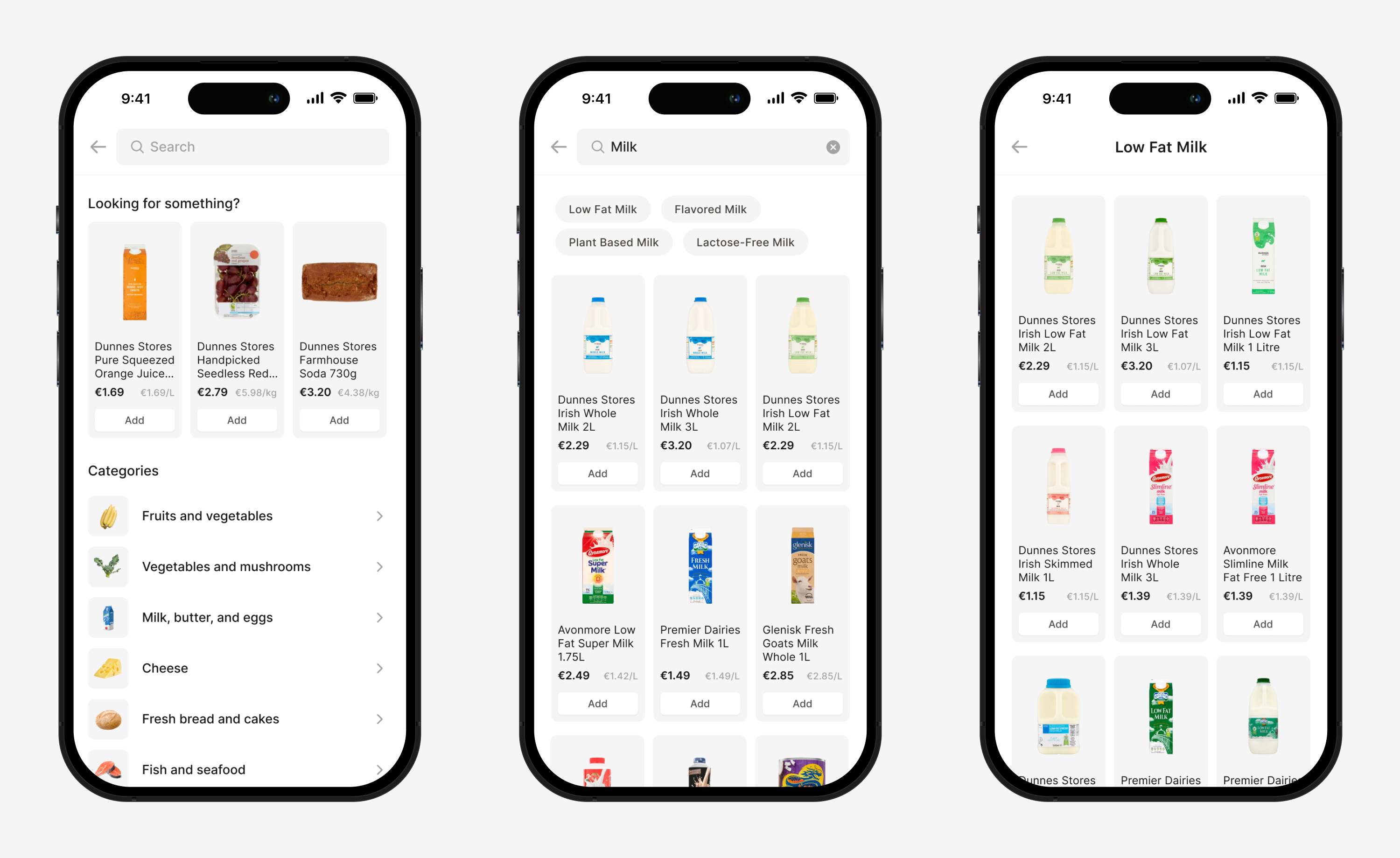
Search
Searching provides a more flexible strategy for finding items, as it allows users to reach an item using any part of the name (e.g. brand, type of product) that they happen to remember.
When people get to the search screen, they are trying to find something. It is possible to use the empty state to “predict” what they are looking for and show shortcuts.
People also rely on search when they want to find a category by its name. If the search provides such results, then people learn these patterns and the search becomes part of the navigation system itself.
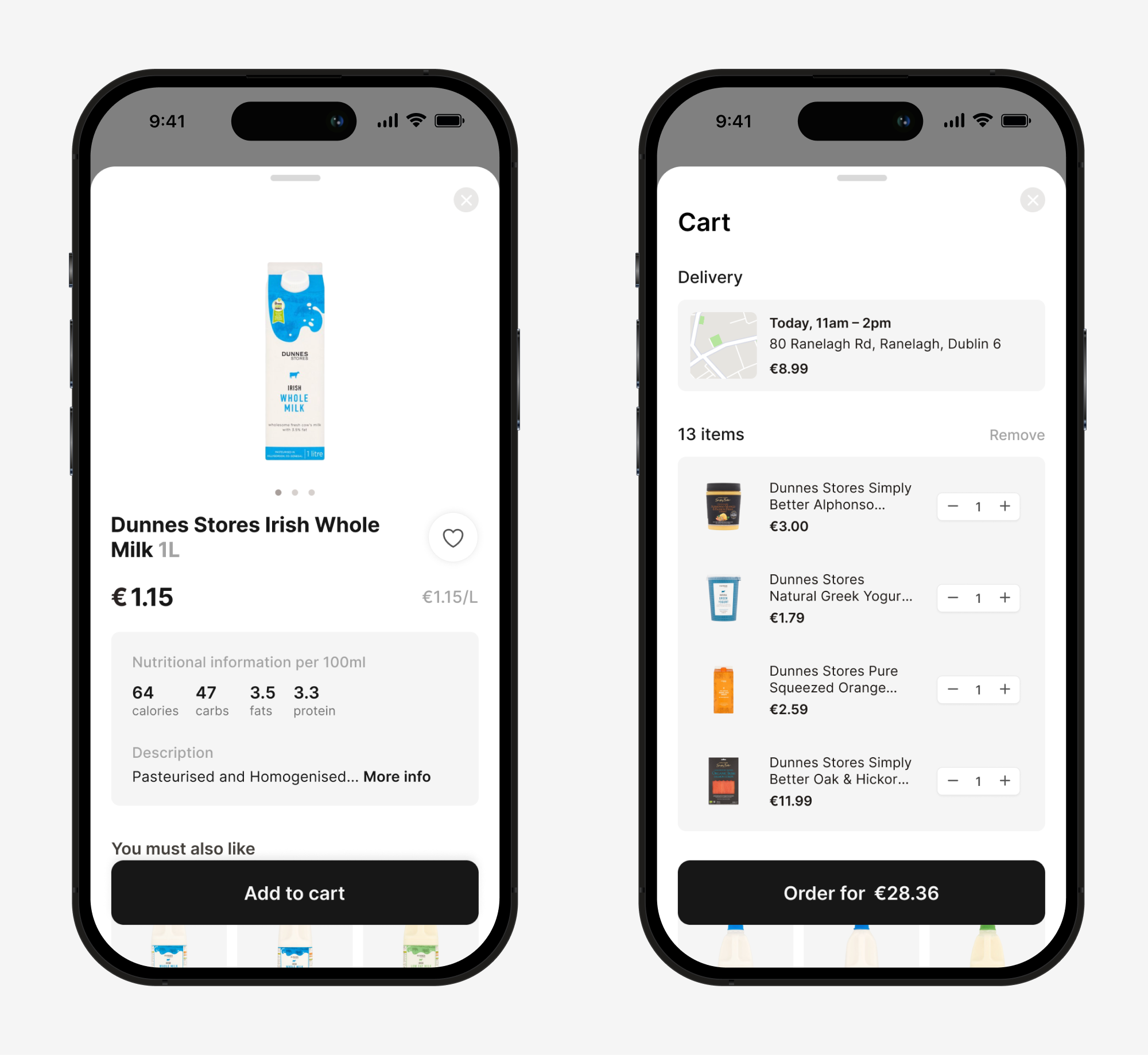
Product card and shopping cart
For the product screen, I prioritized the information based on the research. The most important information, such as product photo, price, price per kg or liter, and nutritional information, was made more visible. To enhance the user experience, the product screen is presented as a modal sheet, allowing users to easily “peek” at the product information without being taken to another screen.
Similarly, for the shopping cart screen, I prioritized the information by placing the delivery address closer to the top so that it remains visible even when a user has a long list of groceries. This way, users can easily confirm their delivery address before checking out.
Conclusion
In summary, the app was redesigned to address several key issues, including confusing navigation and poor layout, limited search functionality, poor checkout process, and inconsistent branding and design.
Next steps include conducting usability testing with a small group of users to gather feedback and make any necessary adjustments before launching the updated app. Additionally, ongoing monitoring of user feedback and behavior will inform future updates to continue improving the app’s user experience.