Good Interfaces
It would be interesting to define what a good interface is. We can start with something simple: A good interface is one that requires minimal cognitive and physical effort to accomplish a task.
This definition is not ideal. In most cases, an interface performs many different tasks. You might want to create, move, and delete things. Now, let’s create the next version: A good interface is one that requires minimal cognitive and physical effort to accomplish the tasks it is supposed to perform.
This has its own problems. Some tasks are performed more often and some less. For example, in a banking app, people send money more frequently than they buy stocks. This leads us to the next definition: A good interface is one that requires minimal cognitive and physical effort to accomplish the tasks it is supposed to perform, weighted by how often each task is performed.
Good designers know this and optimize the same function without consciously thinking about it.
There are a few interesting corollaries that follow from this definition.
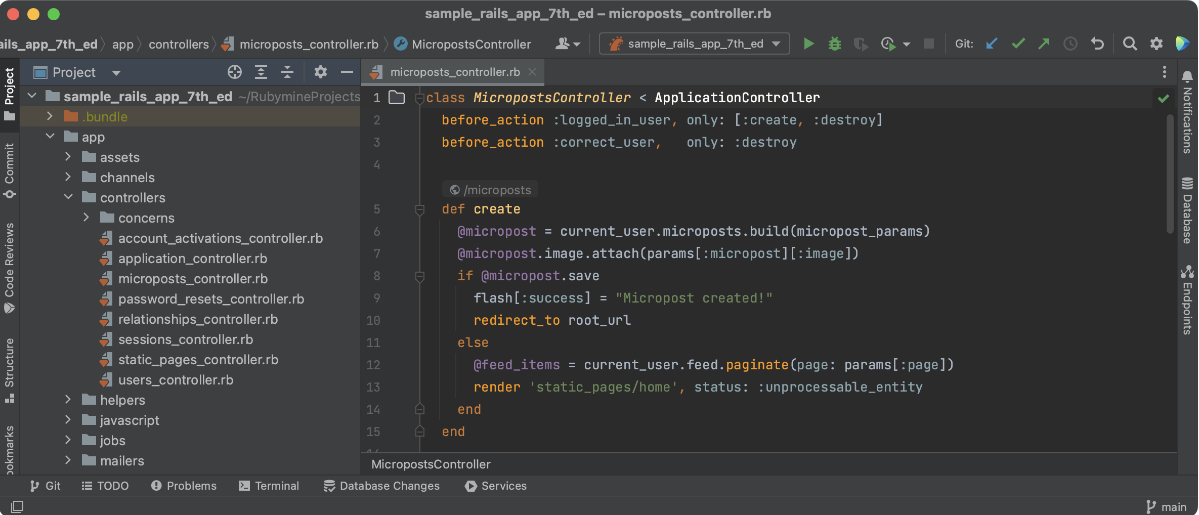
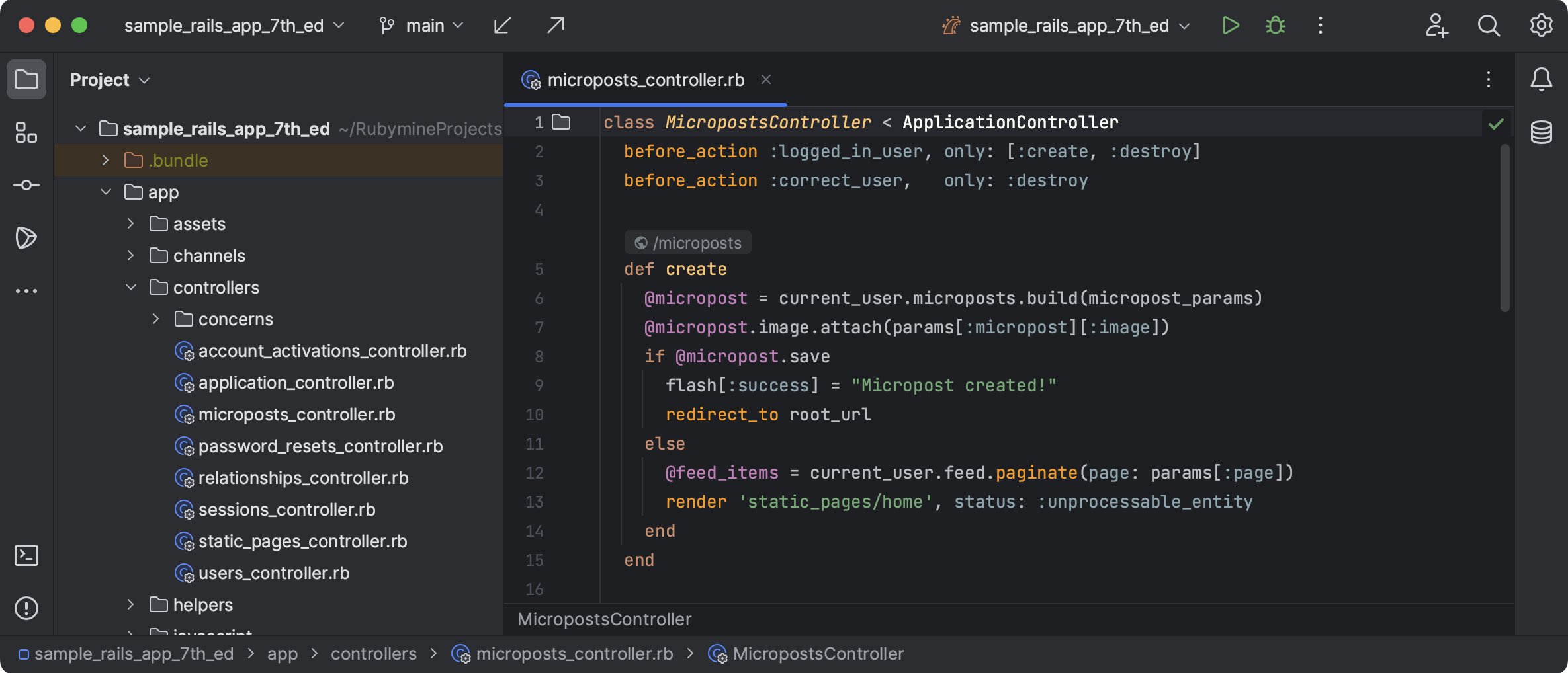
“Clean” interface is not an optimal interface. There is a huge tendency today towards clean interfaces. What designers understand by a clean interface is hiding all important elements behind context menus and reducing information density by increasing white space around elements. However, it’s easy to see how this leads to worse interfaces. It takes more cognitive effort to understand and remember the path to a certain action. It also takes more time to go through this path as it requires more clicks.
A Figma frame with all information hidden might look cleaner, but it’s not that useful.
One good example of trying to create a clean interface is JetBrains’ redesign of their IDE. They removed important elements from the interface used by thousands of engineers and needed to issue a statement to address the feedback they received.


The interface should feel snappy. Internet applications are already too slow. While we have improved how easy it is to build things, we have failed at optimizing for speed. The internet is stupid slow. Animations are great at helping people interact with computers and creating a “magic” feeling, but very often they stand in the way of these interactions. Imagine a web page that takes 500ms to load its resources such as HTML files, JavaScript, fonts, and images — it’s already too late to add a 300ms fading animation on top of that. Waiting for a whole second for an app to start being usable might be too much.
Good interface is not about trends. Another tendency today is chasing trends. Products change their appearance every few years, adding more useless noise to make designs “pop”. Often, designers make these changes only because they can — technologies provide too few constraints to prevent this.
A good interface is like a tool: functional, reliable, and not dependent on the whims of fashion. It minimizes cognitive and physical effort, prioritizes essential tasks, and remains functional and efficient regardless of changing trends.
Designers too often look for challenges in the wrong places instead of focusing on what truly matters — ease of use, efficiency, and functionality.