McMaster is a U.S. supply company with more than 700,000 products, from nails to air pumps. It might be the best example I’ve seen of how to present information to an audience.

It’d be interesting to go over the details here.
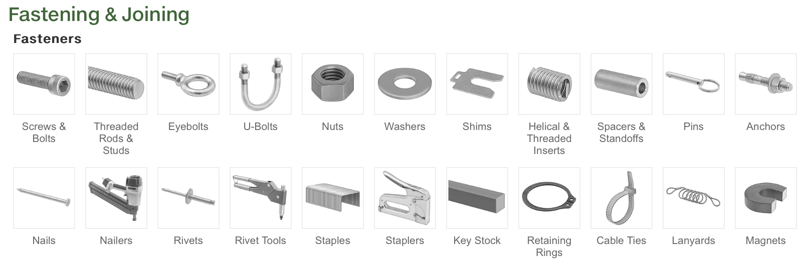
Their catalog is excellent. Each entry has both an image and text, making it easy to understand what’s inside. It strikes the perfect balance between being granular and general.
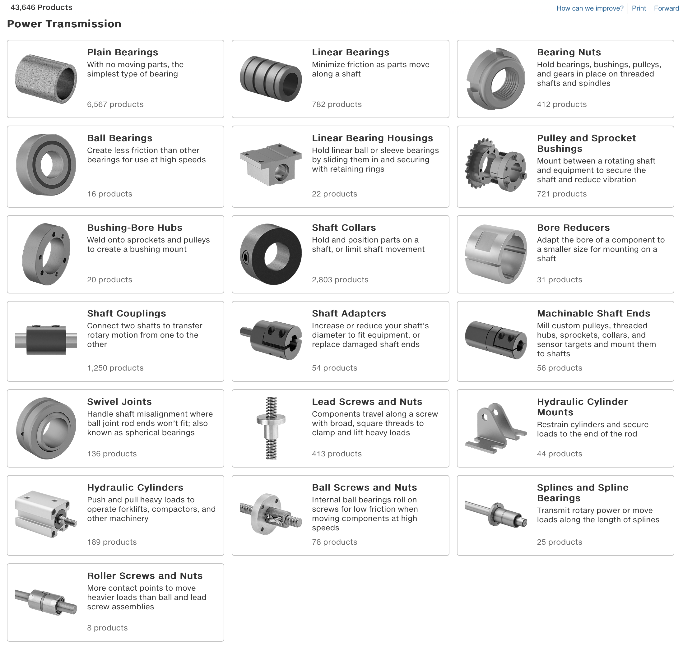
It gets even better when you click a link. Each category has an image and a short description—no fluff, just clear, concise information.
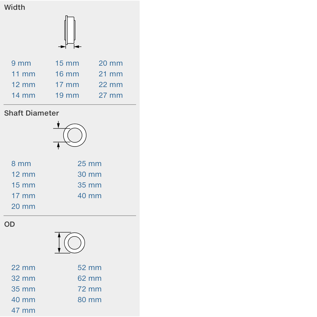
Then come the filters. Each filter has a small image, so I don’t have to waste time deciphering what OD or ID mean.
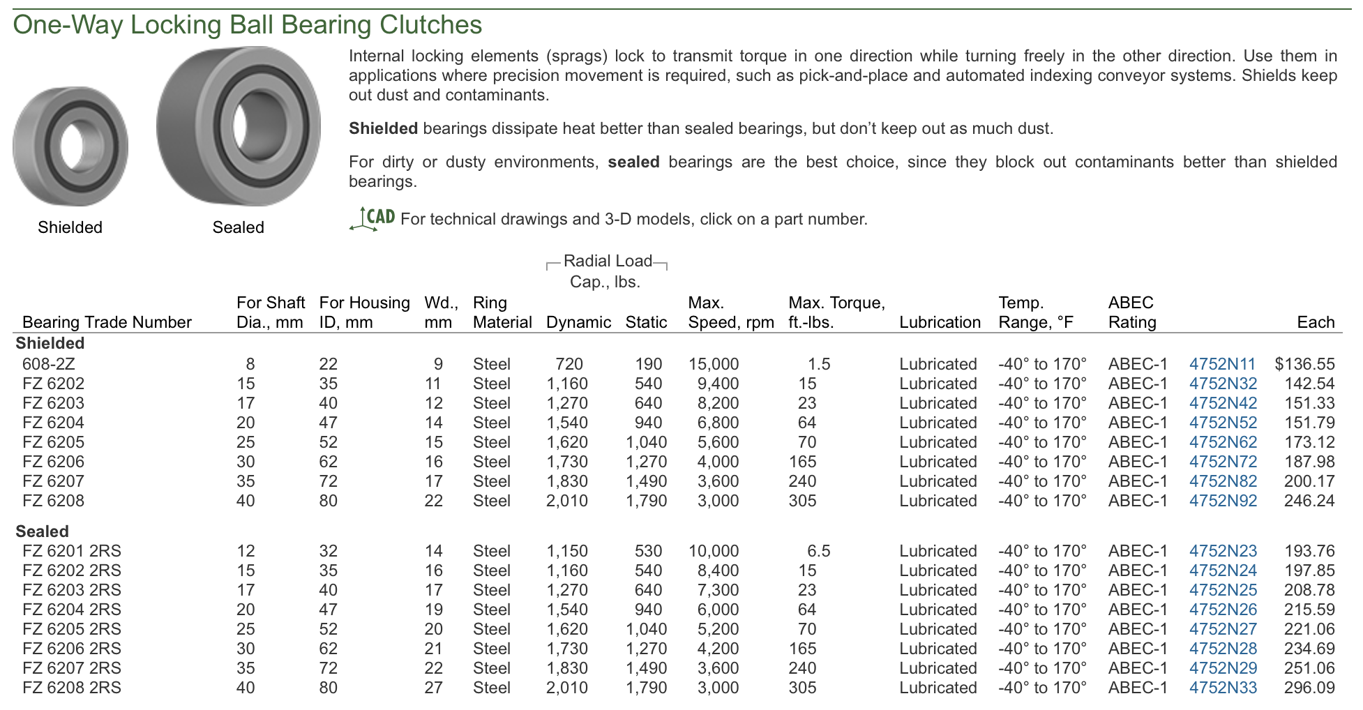
Different options are presented in a dense table, but it’s easy to navigate.
This is what most websites should aim for. People don’t need excessive white space, pop-ups, or email sign-up prompts. They need a functional website where they can quickly find and order what they need.