Drawing My First Font
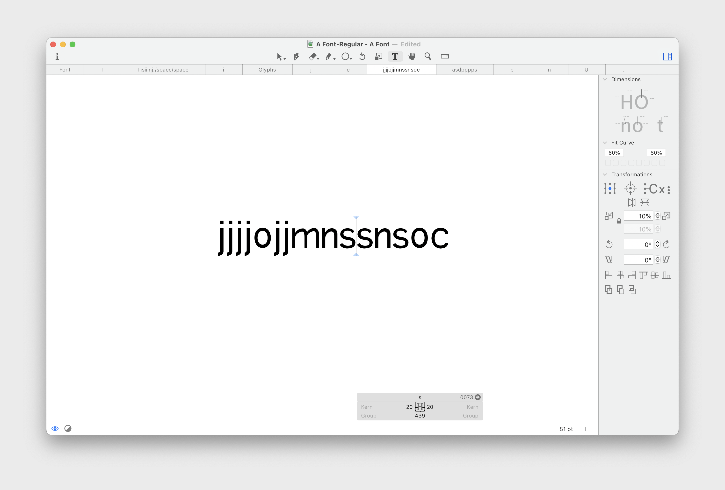
I’ve started drawing my first font. It’s the perfect pastime activity — you massage letters until they start looking good. It’s soothing.
There’s no end goal besides drawing something that I could use for my website. This means I don’t need to think about covering all the glyphs — the basic Latin alphabet would be enough. I’m not even using italics here.
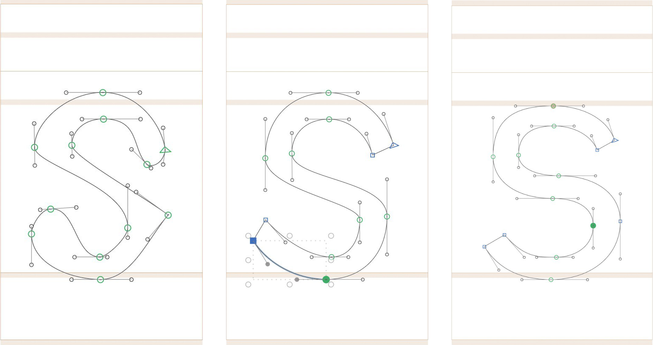
It feels weird not to know the scale, for example, what cap height or x-height to choose. Most of the time, it feels like “I don’t know what I’m doing”. But this is a good feeling because I haven’t felt “stupid” for a while. When you design something for the web, you at least keep your knowledge from using HTML and CSS, so you know the scale. Here’s the medium is new.
For now, I want to push as far as I can without thinking about the font metrics and edit the letters later. It means that I will need to do double work, but it allows me to focus on mastering the tool first.