Case-study: tryrewrite.com
When prepairing to the IELTS exam, many people face challenges in the writing section, primarily due to the absence of quick feedback and the need to use multiple tools for essay reviews. I designed and built a web application to address these issues.


Research
My research into the problem included conducting interviews, collecting feedback from teachers, analyzing essays, and reviewing online resources to identify helpful tools and strategies for effective essay writing.
Based on this research, I decided that I would focus on solving the following problems first:
- Ensuring that grammar checker is tailored to the exam
- Replacing self-checklists with programmatic checks
- Providing faster feedback on essays (including approximate score)
- Providing some guidance for people who are not familiar with the exam
Explorations
Then I moved to exploring the overall design and core components: navigation, cards, layout, colors and interactions.
I researched similar apps such as online and offline text editors, grammar checkers, online essay checkers, Dribbble, book readers, and apps that allowed leaving comments anywhere.

Design
As I worked on the design, I explored a variety of options for different elements of the interface. This was an ongoing process, as I constantly evaluated and refined my choices based on their effectiveness and overall aesthetic.
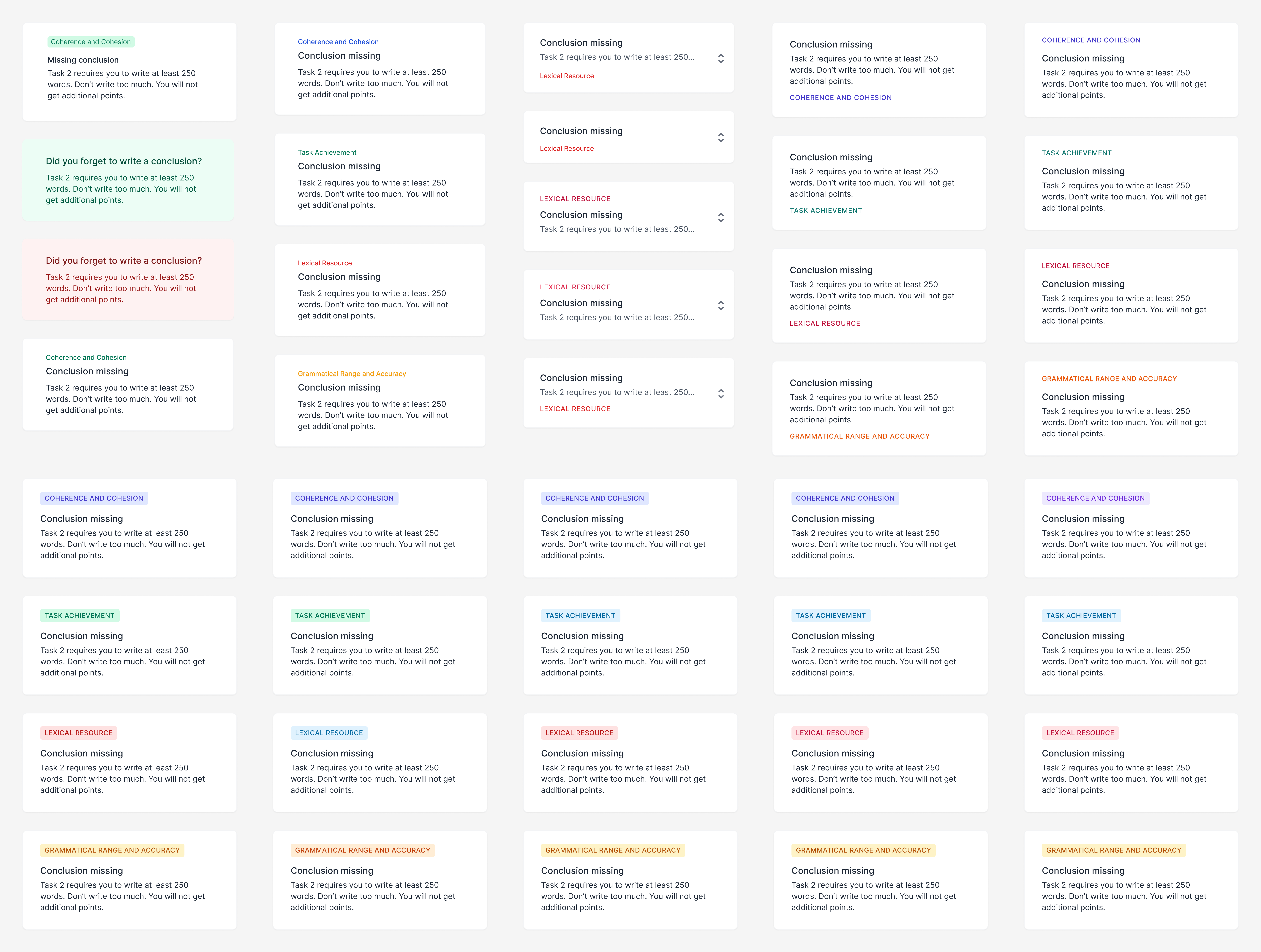
For a moment, let’s consider the main screen of the app — the editor. It consists of a text area for the essay and a sidebar. Let’s take a look at the sidebar.
In the sidebar, there is a list of check cards, which were initially shown on a white background. However, after testing this design on a low-resolution monitor, I found that the cards were difficult to see on a white background, and changed the background color to light gray (1).
In the collapsed form, cards only show a header and one line of description (2). This provides more space for other cards and at the same time, the meaning remains clear. Each card is color coded to reflect the exam scoring system (3). Each card can be clicked to expand and show the check results, with the option to include a link to a more detailed explanation of the check (4).

Interactions
One aspect of the UX design that I particularly liked was the way that underlined text interacted with the corresponding check card. Clicking on an underlined check scrolls the sidebar to the related card, and clicking on a check card scrolls the text to the card. This feature helps users easily connect checks with the corresponding text.
Another key feature of the app is the ability to apply suggestions without manually copying them. For instance, when a grammar check produces a suggestion, users can simply click a button to apply it, making the correction process more efficient. This feature enhances the user experience by making it easier and faster to fix mistakes.
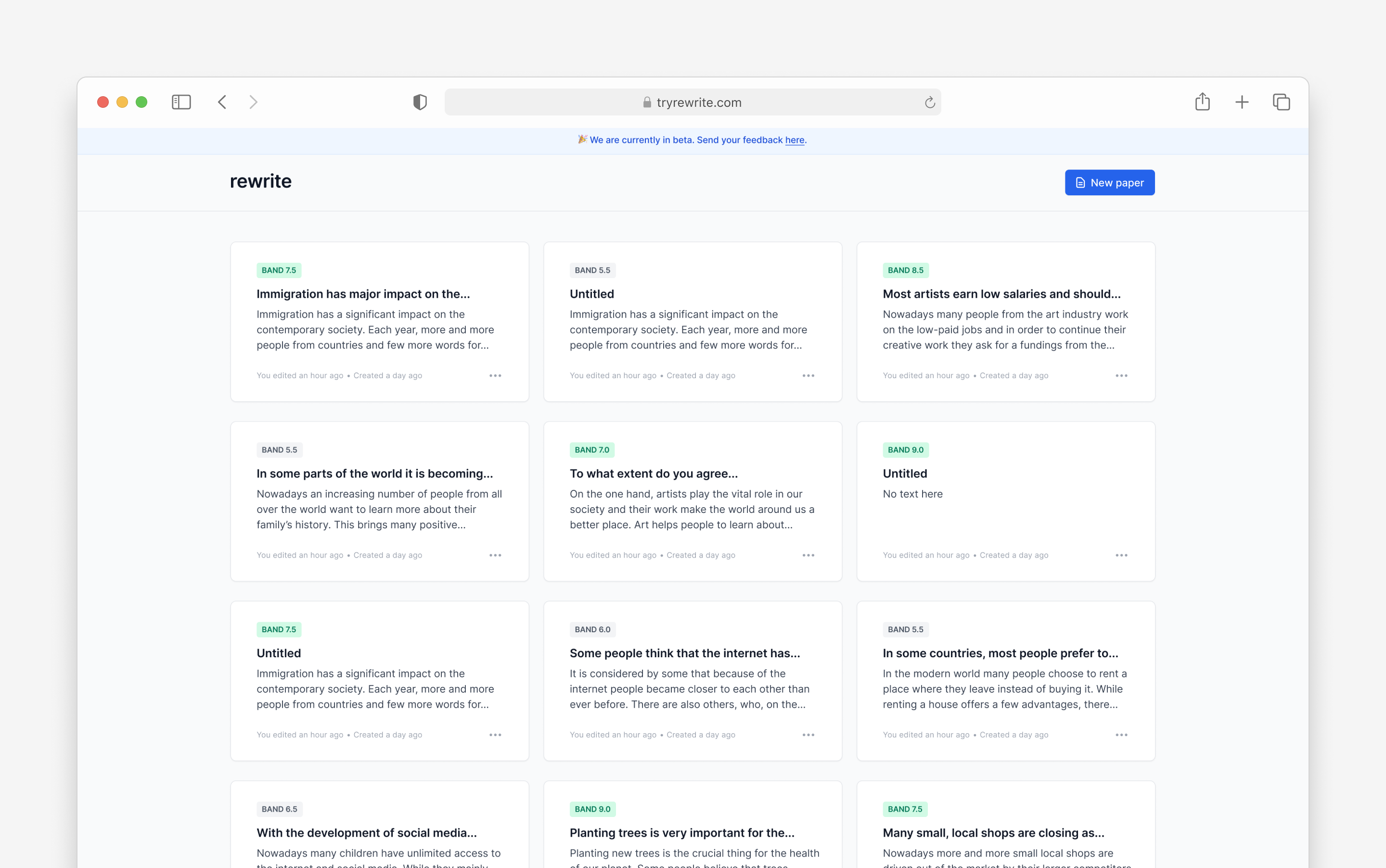
Other screens
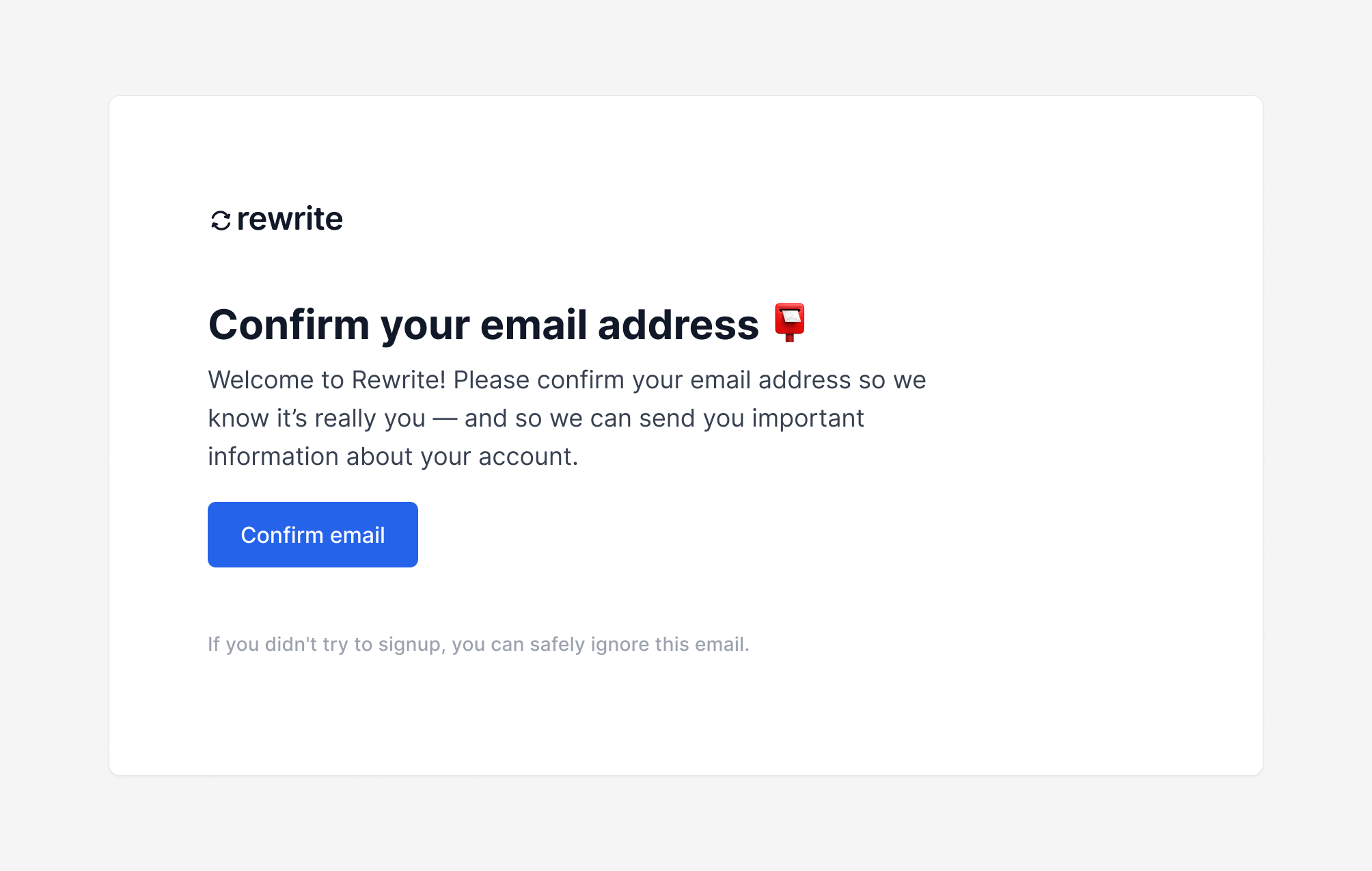
Besides the editor, I also designed other app screens, including the sign-in, sign-up, password reset, and dashboard screens, landing page as well as all the transactional emails that the app sends.

Results
I conducted a few more interviews with people to get feedback on the app. People said that the app replaced multiple other tools for them, was clear and easy to use. The main concern was about the reliability of the calculated score. It felt too “mechanic”. Unfortunately, it was the feature that I thought was worth charging for because it saved people time and money. I removed it until I can come up with a more effective solution.
Then, I thought that might leverege LLM for essay scoring. I built a Telegram bot that provided text feedback on essays to validate this idea. The scoring was still not accurate enough, and the API was quite expensive (12 cents per call for a fine-tuned model). Additionally, the training data was very limited, so it’s possible that the exam organizers will implement their own AI-based scoring system in the future, rendering my app obsolete.
Considering all these factors, I decided to stop working on this app.
