Similar Typefaces
In Who Buys Fonts Gwern writes:
[…] they decided to spend millions of dollars churning the font used or read by billions of people to a new one which looks eerily like a squarer Calibri and which is indistinguishable from MS’s previous Segoe, Google Roboto, Apple San Francisco, or Helvetica.
He supports his argument by an image of the letters of Aptos, Roboto, San Francisco, and Helvetica.
Whether Microsoft should have changed its default font is a separate discussion. I’d like to focus on typefaces matter even when they look similarly.
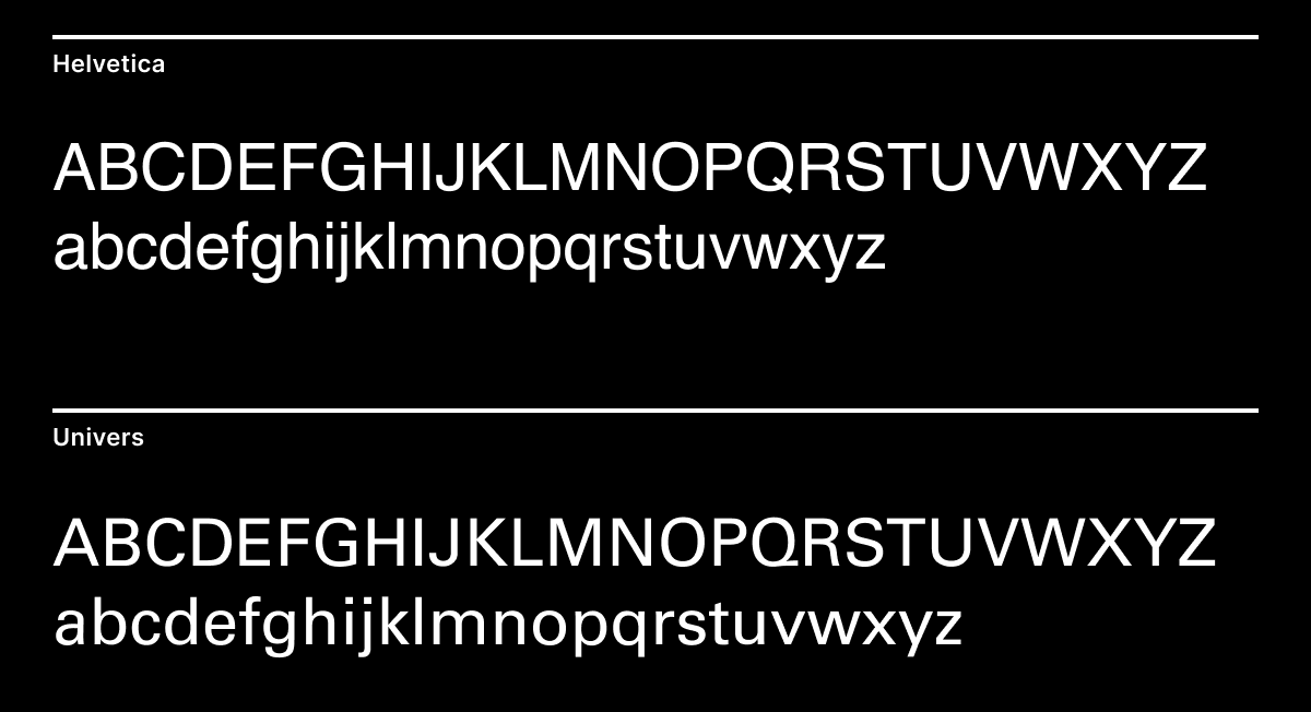
For the experiment sake, let’s consider Helvetica and Univers. They are both based on Akzidenz-Grotesque (also called Standard). They were released in the same year. They don’t have any serifs, and their letter shapes look almost the same. There are some minor differences in letter forms — especially a, k, K, G, R, and Q, and some differences in weight — but is it enough to justify using one over another?

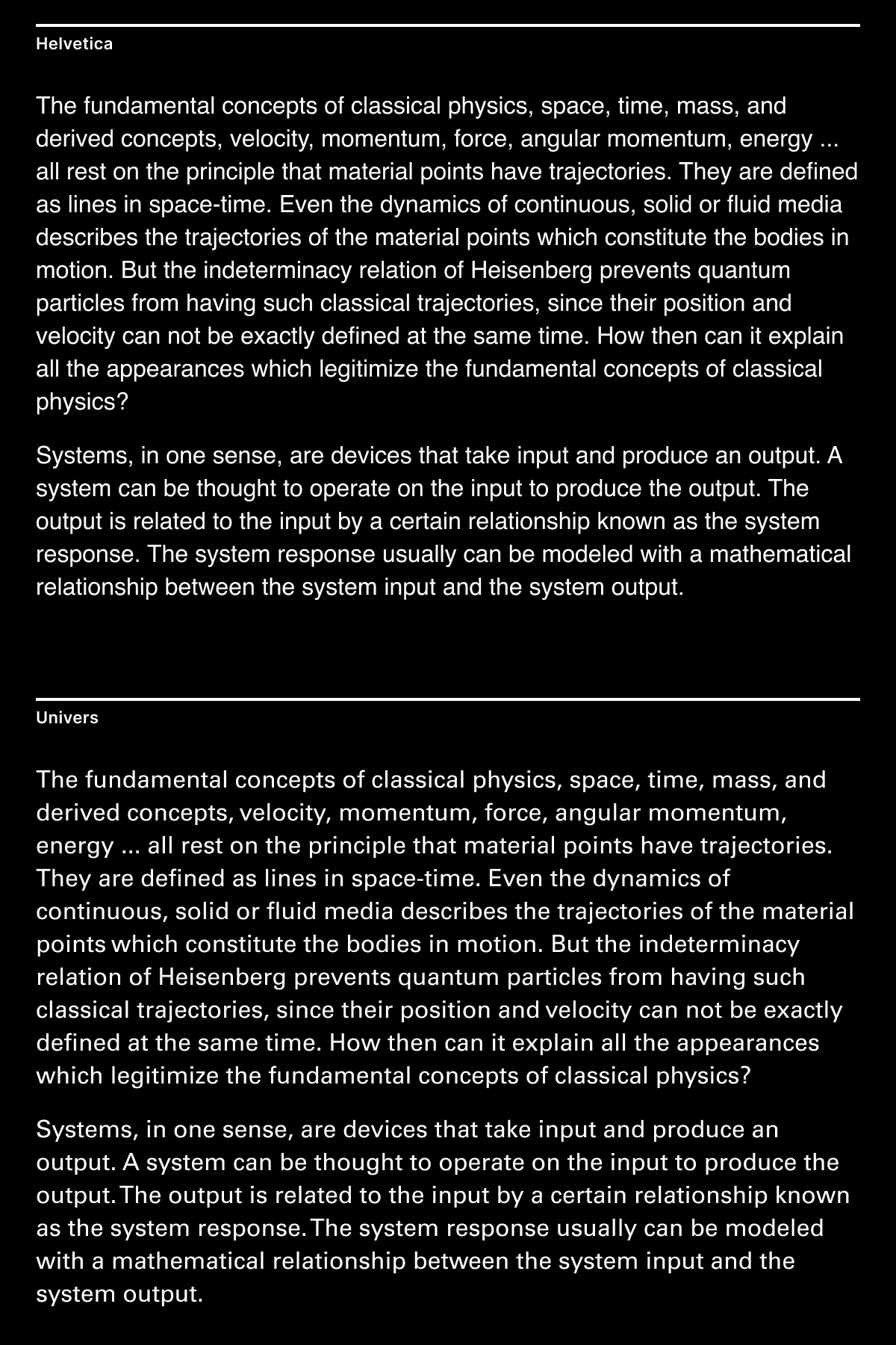
Now let’s compare texts that are set in these fonts. The difference becomes obvious. Helvetica has a more familiar feel as you have seen many times, it is also pretty hard to read in such small sizes, and it appears somewhat “mushy” as if letters were thrown together. In contrast, Univers conveys a sense of orderness and mathematical precision; it’s also easier to read.

Typography is close to cooking where mixing ingredients together and then adding a small pinch of spices creates something better than the sum of its parts. You can’t predict the flavour of a dish by just looking at the ingredients. Similarly, you can’t appreciate a typeface by just looking at its letterforms.