[…] they decided to spend millions of dollars churning the font used or read by billions of people to a new one which looks eerily like a squarer Calibri and which is indistinguishable from MS’s previous Segoe, Google Roboto, Apple San Francisco, or Helvetica.
He supports his argument by an image of the letters of Aptos, Roboto, San Francisco, and Helvetica.
Whether Microsoft should have changed its default font is a separate discussion. I’d like to focus on typefaces matter even when they look similarly.
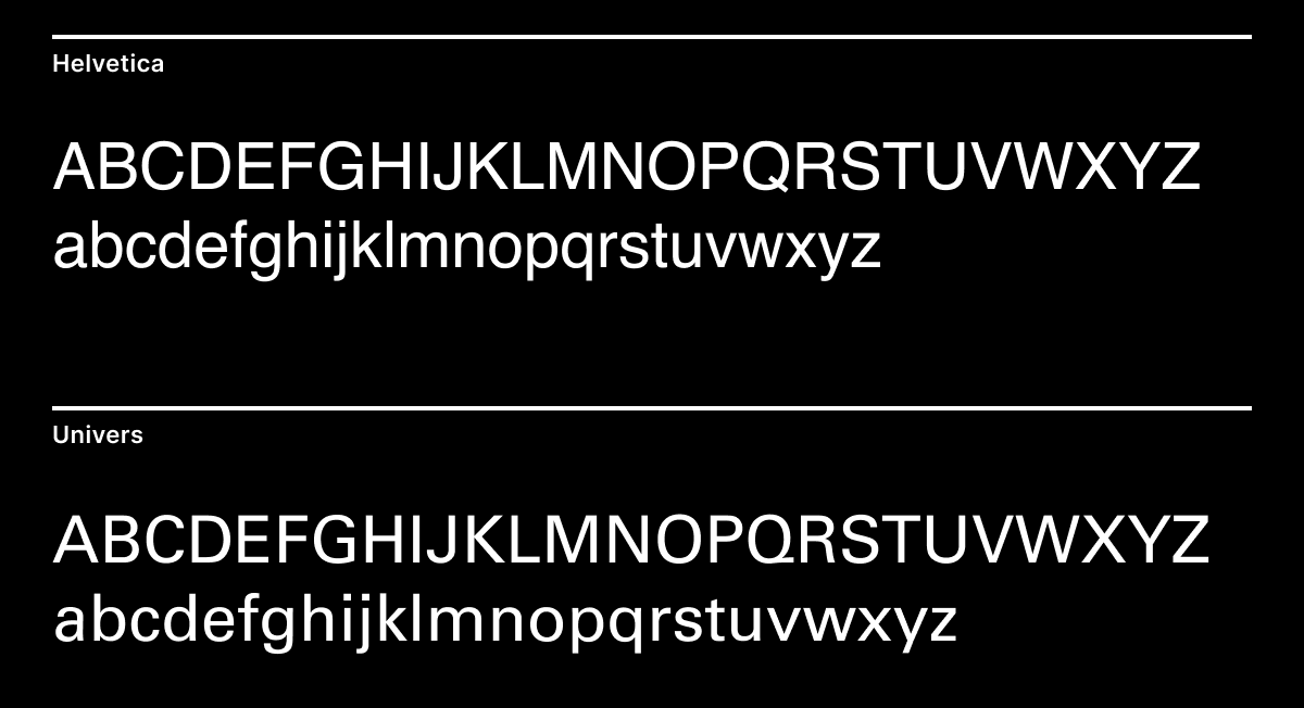
For the experiment sake, let’s consider Helvetica and Univers. They are both based on Akzidenz-Grotesque (also called Standard). They were released in the same year. They don’t have any serifs, and their letter shapes look almost the same. There are some minor differences in letter forms — especially a, k, K, G, R, and Q, and some differences in weight — but is it enough to justify using one over another?
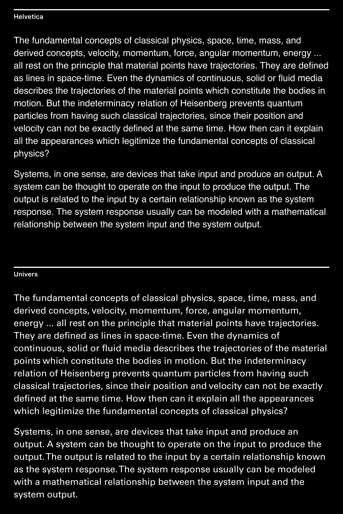
Now let’s compare texts that are set in these fonts. The difference becomes obvious. Helvetica has a more familiar feel as you have seen many times, it is also pretty hard to read in such small sizes, and it appears somewhat “mushy” as if letters were thrown together. In contrast, Univers conveys a sense of orderness and mathematical precision; it’s also easier to read.
Many people consider typography a designer’s whim. Very often it is true, designers select typefaces without having any taste in typography. The existence of typeface matching websites only confirms this theory. But there are cases when good typography elevates text or interface. When used delibertely and with skill, typography is closer to cooking where adding a small pinch of spices can transform a dish’s flavor.
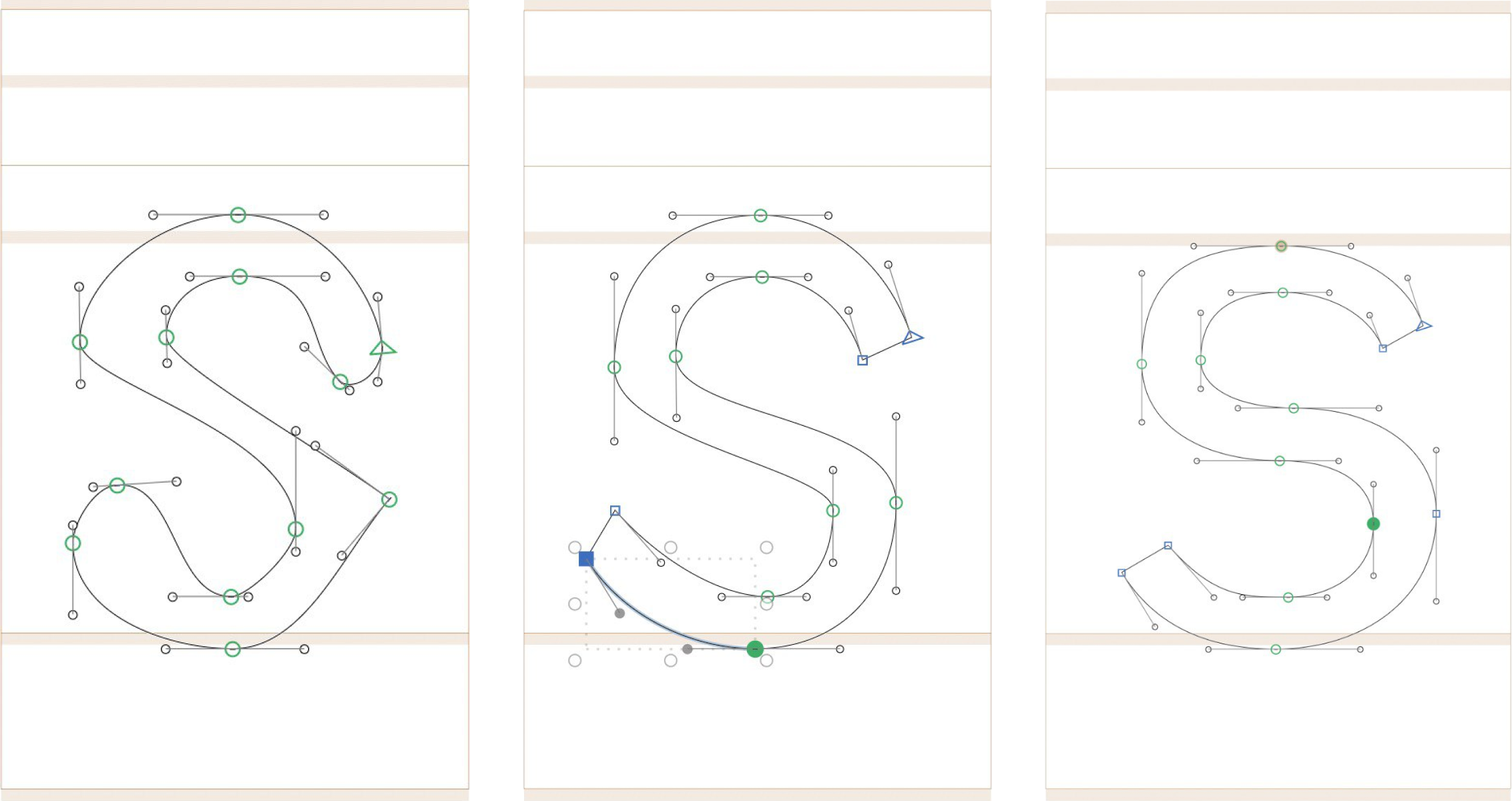
I’ve started drawing my first font. It’s the perfect pastime activity — you massage letters until they start looking good. It’s soothing.
What the process looks like
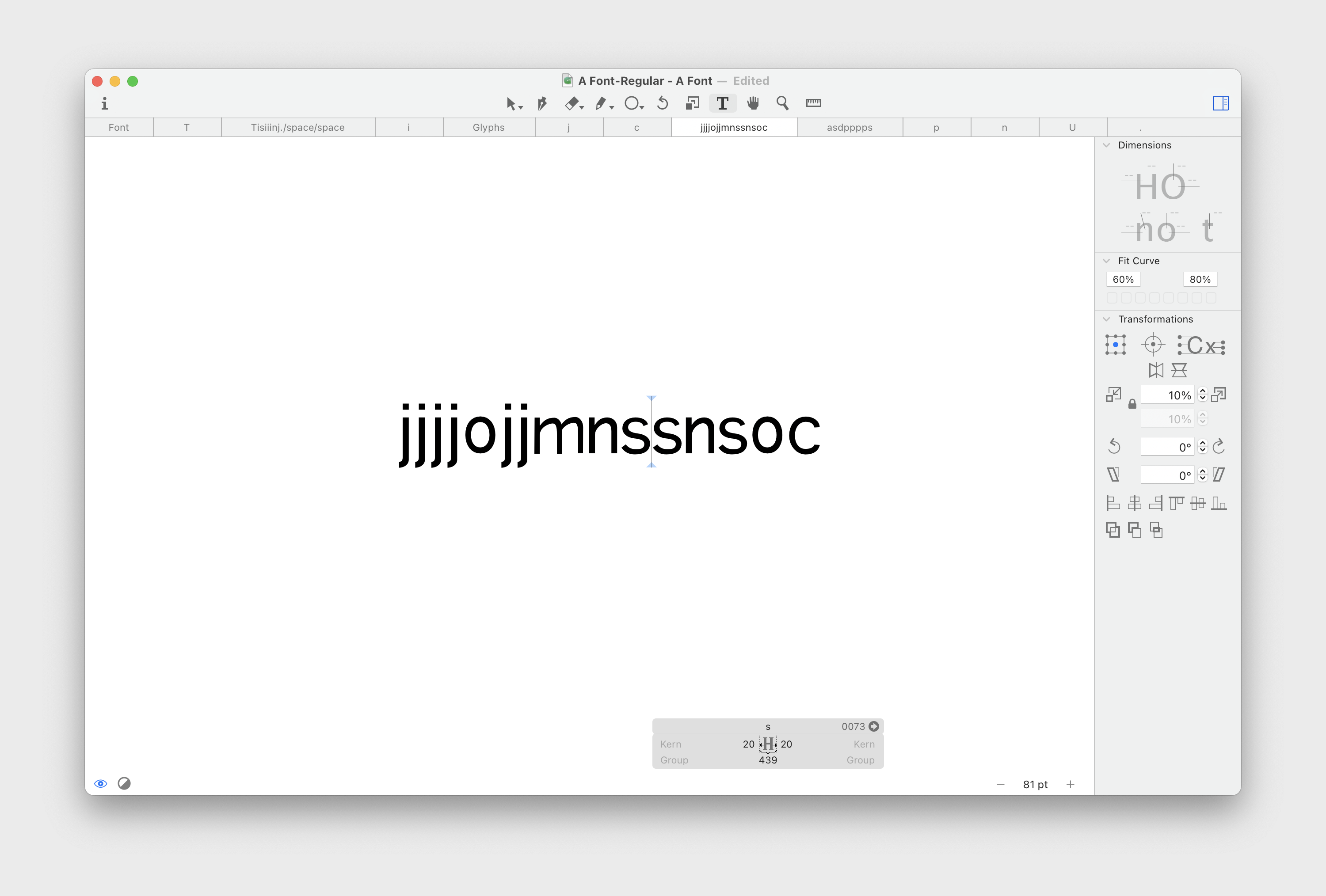
There’s no end goal besides drawing something that I could use for my website. This means I don’t need to think about covering all the glyphs — the basic Latin alphabet would be enough. I’m not even using italics here.
It feels weird not to know the scale, for example, what cap height or x-height to choose. Most of the time, it feels like “I don’t know what I’m doing”. But this is a good feeling because I haven’t felt “stupid” for a while. When you design something for the web, you at least keep your knowledge from using HTML and CSS, so you know the scale. Here’s the medium is new.
For now, I want to push as far as I can without thinking about the font metrics and edit the letters later. It means that I will need to do double work, but it allows me to focus on mastering the tool first.
Focus on better, not on newer. Why are we obsessed with the new? We should be obsessed with better. That is what drives us at Vitsœ. After all, it is the way that the natural world operates: constantly improving, not launching new species.
Every company, every movie director, everyone tries to create something new. Very few people try to make something better. Many forgot that creating new is not the goal, it’s a byproduct of creating something good.
Maybe it has always been like this. People create new things, it’s our nature. Still, it feels today time between fashion trends is narrower.
Creating new things for the sake of being new not only brings shallowness, it also deteriorates the quality of what we already have. We destroy what has been done before and instead fill our world with novel inferiority.
Quality work requires patience, contemplation and deep thought. In the race to “innovate”, there’s little time left to pause and reflect.
I’ve put together a little interactive demo on variable fonts where the font’s weight and optical size change when you move your mouse around. It’s easier to see how the letter shapes adapt to the changes. Notice how the letters “open up” when the optical size decreases and how the stroke thickness varies unevenly when the weight changes.
One interesting thing I noticed while playing with it is how cool it feels when your actions and their results are coupled. When you work with a computer, your thoughts and actions are translated into a series of discrete steps. You type a letter, create a rectangle, or open a tab. This is not how we communicate with objects in real life. But this example feels closer to how you drive a car or play a musical instrument.
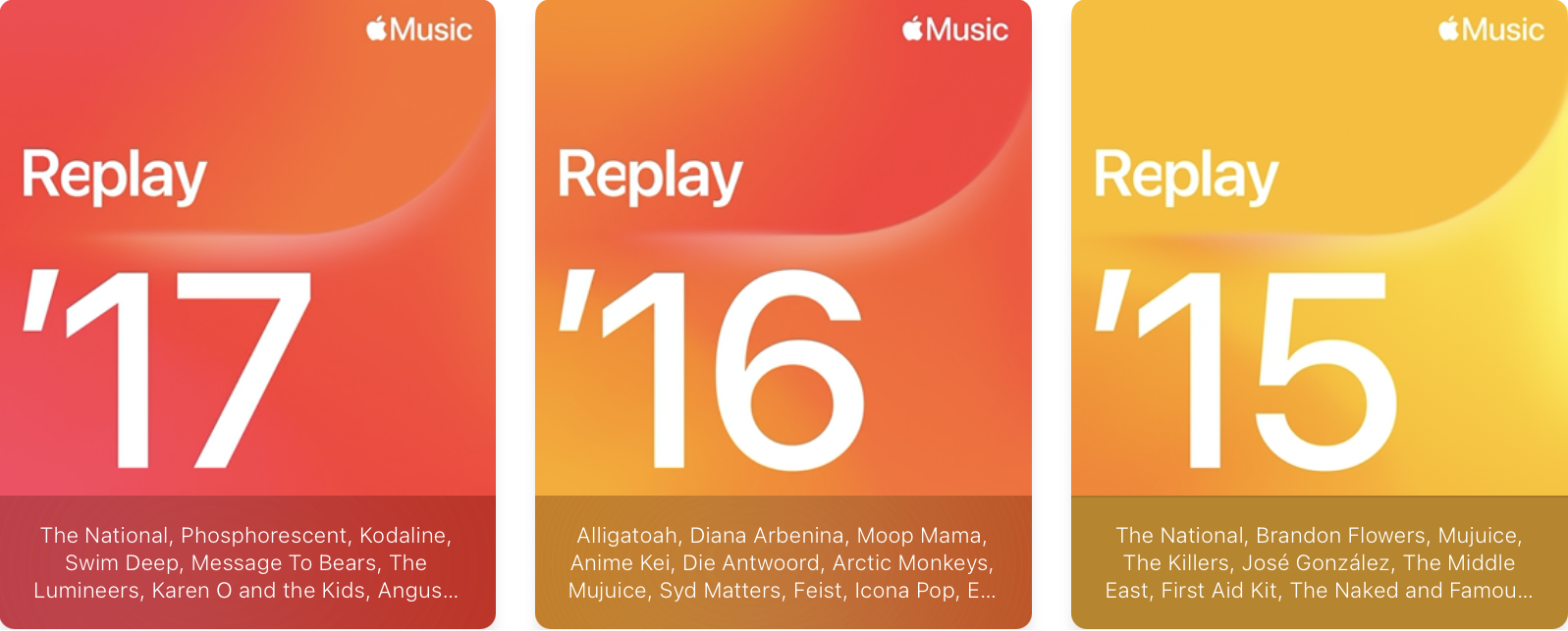
I used Apple Music in the 2010s then switched to Spotify and I used Spotify for a few years. Recently, Spotify made a fewcontroversial product decisions, nudging me to switch back to Apple Music.
After renewing my Apple Music subscription and logging into my account, I discovered that my song collection was missing. Since Apple Music recommended me songs based on what I played a few years ago and because I could still see my Replay playlists from the past years, I was hoping that my library will eventually resync. So I kept using Apple Music anyway because I thought it was a glitch.
A few months passed with no change, so I contacted Apple support. They told me that this was intentional, citing a clause on their support website:
If you canceled your subscription to Apple Music or iTunes Match, your music library is removed on all of your devices except for the device your music library is stored on. Any music, including playlists, that you added or downloaded from the Apple Music catalog is also removed.
Thus, Apple deletes your library after a few months after you cancel your subscription.
This was unexpected and, frankly, ridiculous. I can’t find any justification for this user experience. Even if licensing rights are an issue, Apple could at least preserve a file with the IDs of songs I liked and restore them when I renew my subscription.
Now I must choose between a company that holds my data hostage and a company that neglects its UX.